The art & science of organizing and labeling Workable settings
Have you ever been using software, such as a text editor or drawing tool, and had to use Google to search; “Where is the X setting in this software”? If so, you may have been a victim of bad content structure! Unfortunately, this is a common problem with fast-growing software tools, because functionality and content are normally added over time to the tool within the existing structure.

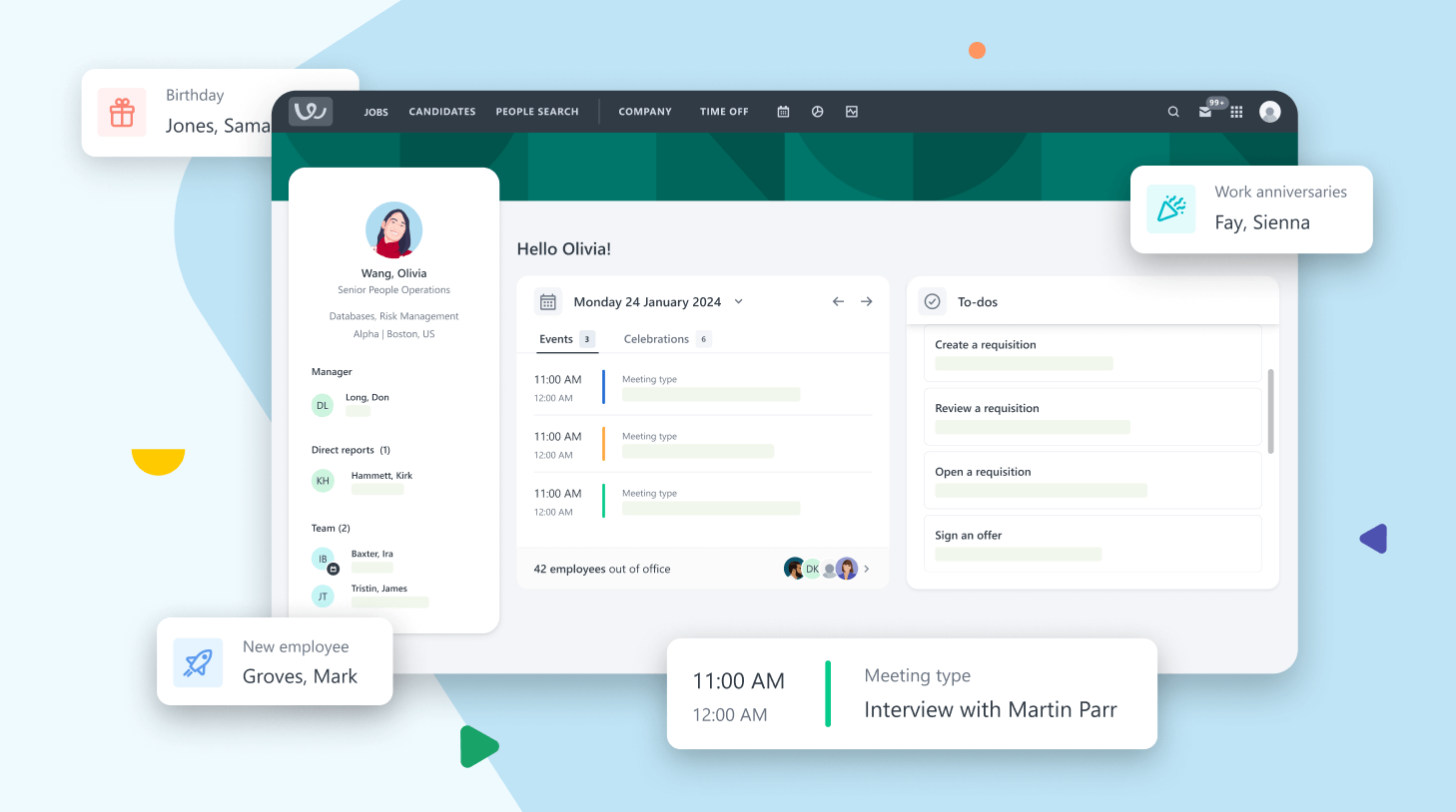
Here at Workable, we have a long list of things we are eager to add to our roadmap. At the beginning of this year, time had finally come for us to give some TLC to our tool’s settings pages. It might seem less important compared to our core features, but settings pages are a very powerful part of a product. Not only can users take full control of their options and preferences, but it also allows us to cater to different types of users who can use Workable in ways specific to their needs.
Our goal with the Workable settings pages was to examine and improve them in terms of information architecture. It is a fact that the settings pages had grown vastly over the last few years as more and more features were added to the product and they introduced more settings respectively. Good information architecture helps users understand where they are, what they’ve found, what’s related, and what to expect.
Testing the current structure
First things first: research! We ran a tree test on the current settings pages to understand which areas were in need of improvement. Most participants easily found basic settings such as where to change their profile photo or manage their email templates. However, most participants had difficulty finding where they would complete tasks such as: “You want to enable the Talent Pool option so candidates can send applications to your account mailbox” and “You want to change the brand color of your career pages”.
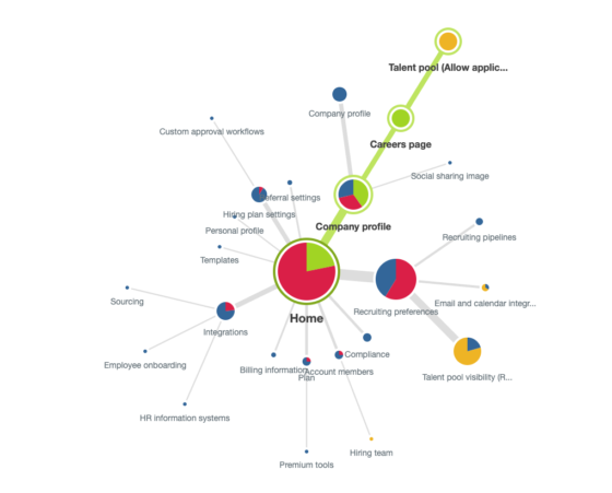
As seen in the pie tree below, participants were looking to enable the talent pool option in almost all areas of settings (they navigated to the blue and red circles). Just 10% found the right answer right away, 24% found it eventually and 66% did not find it at all (they nominated the orange circles). It took 36 seconds on average to complete this task, compared to just 10 seconds that it took them to complete some of the easier tasks.
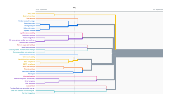
 We also ran a card sorting activity to see into what categories participants would group the settings content. The dendrogram below shows that participants created roughly eight groups of items with 70% agreement. There was no strong consensus for some cards like Interview locations, Access token and Talent pool visibility. The latter is an interesting finding because it shows that participants not only could not find this easily, based on the tree test discussed above, but also are not sure what group to place it in either, according to the card sorting test.
Designing the new experience
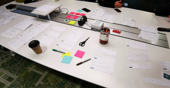
Equipped with the results discussed above and insights about what areas need improvement, we hit the drawing board. We ran a physical card sorting workshop with four Product Designers and myself, a UX Researcher. Our card sorting activity, however, had a fun twist: instead of using cards with content labels, we used cards with UI images. As seen in the photo below, we printed screenshots of each section of the settings and cut them up into individual cards.
The reason we introduced the UI, which is normally not a focus for information architecture, is that we only had the “development budget” to move and rename sections without making any more changes to the system. In other words it was a given factor that we had to work with so we wanted it to be prominent for our decision making regarding the structure and order of the pages.
The new grouping looked fresh and exciting, even though it was not easy to let go of the existing structure that was carved into everyone’s brain until now. We had to consider changes that were planned to come to the product soon, as well as differences in the settings pages that depend on the feature availability per customer. In a nutshell:
- Top-level groups were introduced to shape and deepen the structure: Recruiting, Company and Personal settings
- A new dedicated page called Career Page was introduced, since these settings were previously under Company Profile
- A new page called Privacy was introduced, which gathered previously scattered privacy settings
- The Recruiting Preferences section became obsolete since all items have been moved to more appropriate sections
- Personal user settings that apply globally across the different Workable tools (ATS, Referrals, Bridge) have been placed into a new page called Your profile outside of the Workable settings
Validating the new design
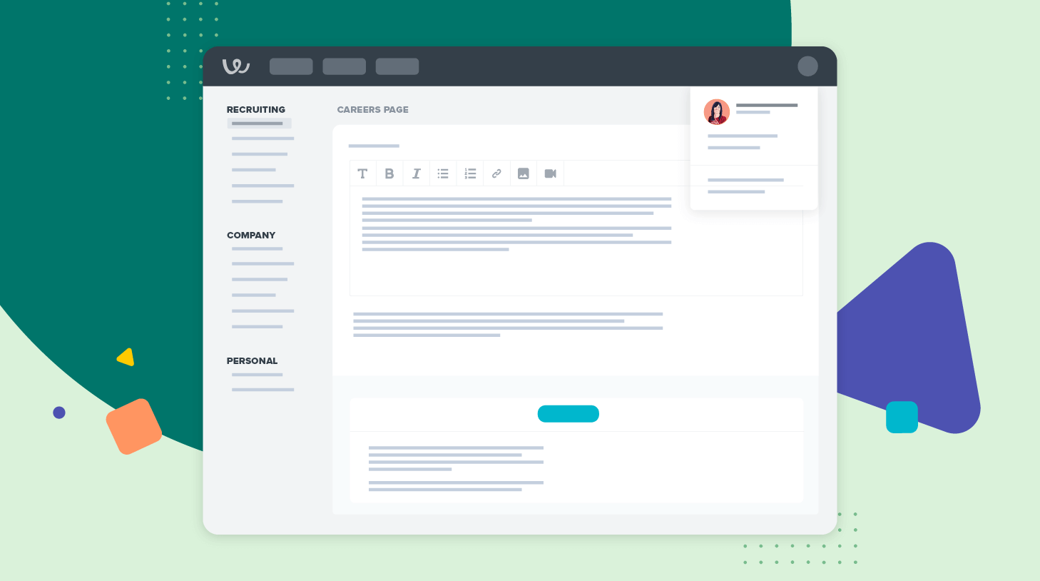
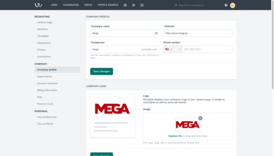
We were pretty excited with the new top-level groups (Recruiting, Company and Personal) and got positive feedback from our teammates and management team about the new design. We prepared mockups and a prototype to preview the experience in Figma, as seen below.
As a final sanity check we ran another tree test with the new structure. To our disappointment but also expectation the new structure did not perform flawlessly. Most participants easily found basic settings such as where to change their company logo or manage their custom recruiting pipeline, but some advanced settings are so unique that there is no obvious group to place them in.
For example, a lot of participants had difficulty finding where they would complete tasks like: “Allow candidates to only see the 1st level of the departments structure in your job postings (e.g. Product instead of QA testing)” and “Change your time zone so you can accurately schedule events”.
Nevertheless, testing the new structure helped us identify potential problem areas and allowed us to make final improvements before launch. For example, users seemed to confuse the two pages in the Personal Group, Your Settings and Your Profile. We realized that these labels might seem a bit generic and interchangeable so we renamed Your settings to Your preferences, to be more specific.
We believe that the new settings pages will improve our customers’ experience by helping them easily find what they are looking for, discover options and manage powerful settings. Our goal is to make things easier now and in the future, as new features and more options are introduced in Workable.
Korina Loumidi is Workable’s Principal UX Researcher. She was part of the team that revamped Workable’s settings.