On a mission to build one of the best career sites?
I put together a list of 10 company career sites that do a great job with:
- Employer Branding — Pictures, videos, values, benefits, employee content, and employer of choice awards
- Career Page Design — Color scheme and page layout
- Content/Copy — Headline, Sub-headline, career page copy
Here’s the list of 10 of the best career sites I’ve seen in 2020 so far:
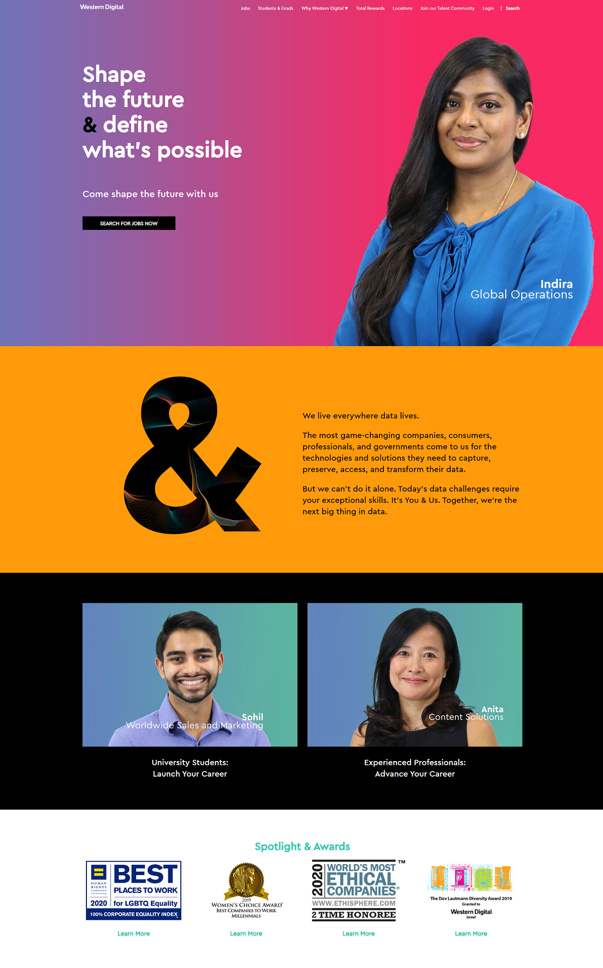
Western Digital
- Great color scheme — It catches your attention right away.
- Meaningful text — Fewer words makes them more effective. Less is more.
- Career Paths — They have an option for Students and Experienced Professionals which links to specific content. This creates a more targeted, better candidate experience.
- Employer of Choice Awards — Always a best practice for company career sites.
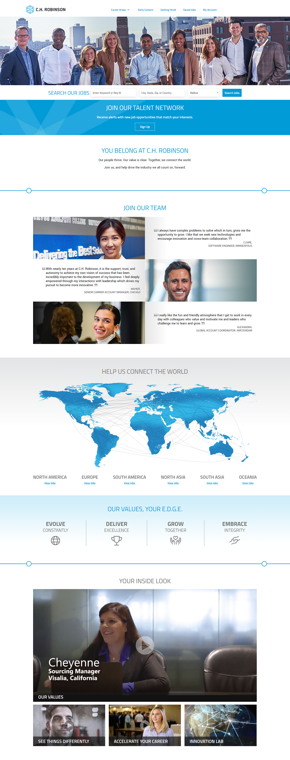
C.H. Robinson
- Feature Image — An awesome picture of the diverse team at C.H. Robinson.
- Job Search — Prominent and above the fold, it’s the primary call-to-action for your career page.
- Talent Network — Usually this opt-in is found at the bottom of career pages. It’s great to see a company put it at the top to collect as many sign ups as possible.
- Employee Content — They supplement their career page with a lot of employee content including quotes/testimonials and videos (Values, career path,
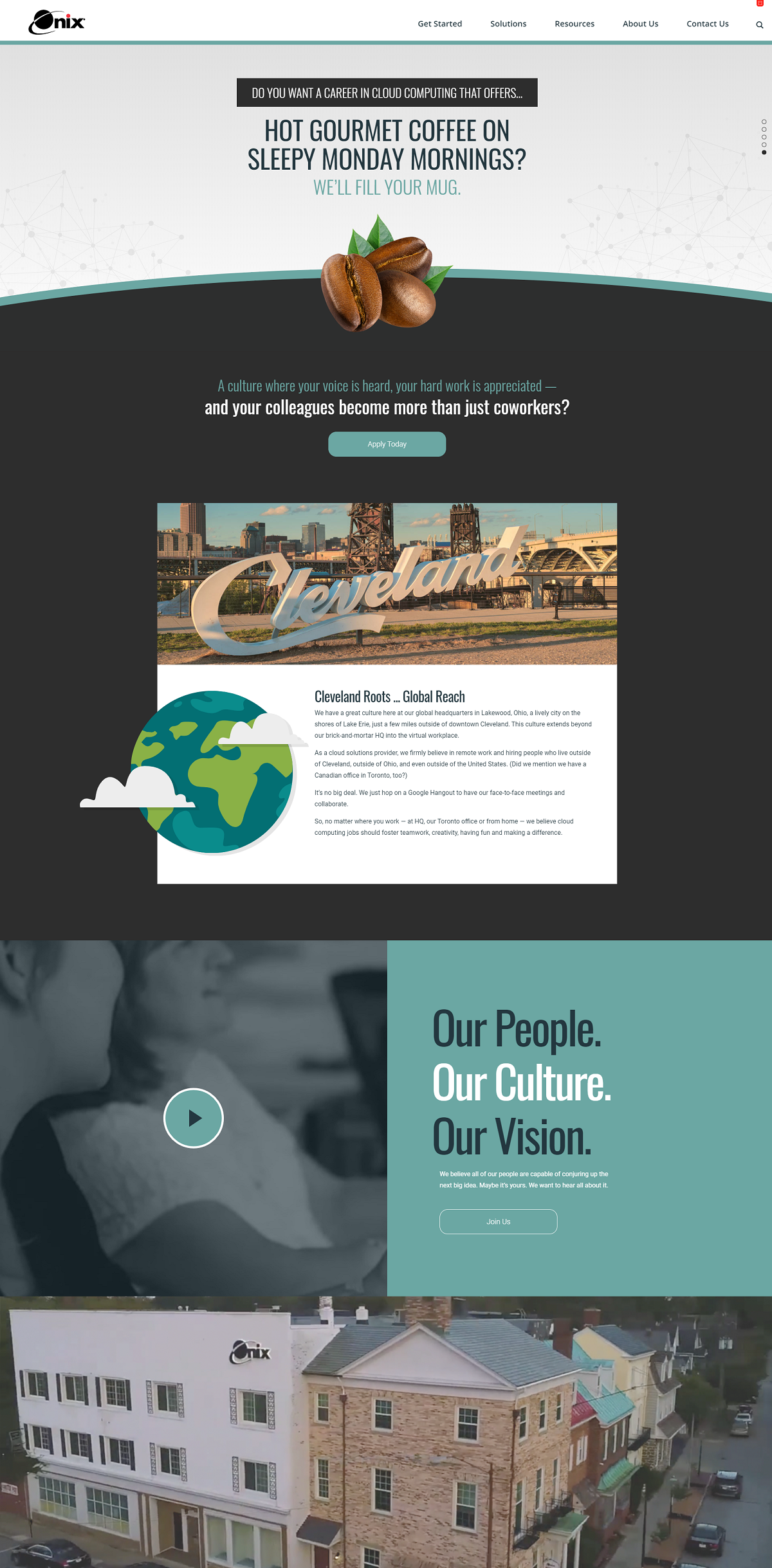
Onix
- Headlines of Value to Candidate — The rotating set of headlines are all about the value to the candidate (1 day volunteer time off; walking distance from restaurants, etc.)
- Great Sub-Headline — The next headline underneath the major headline is about “A culture where your voice is heard, your hard work is appreciated – and your colleagues become more than just coworkers? Most companies just have a header saying “Culture” but Onix goes the next level and gives texture about the culture.
- Easy Call-to-Action — The clear call-to-action is the Apply Today button and it’s front-and-center.
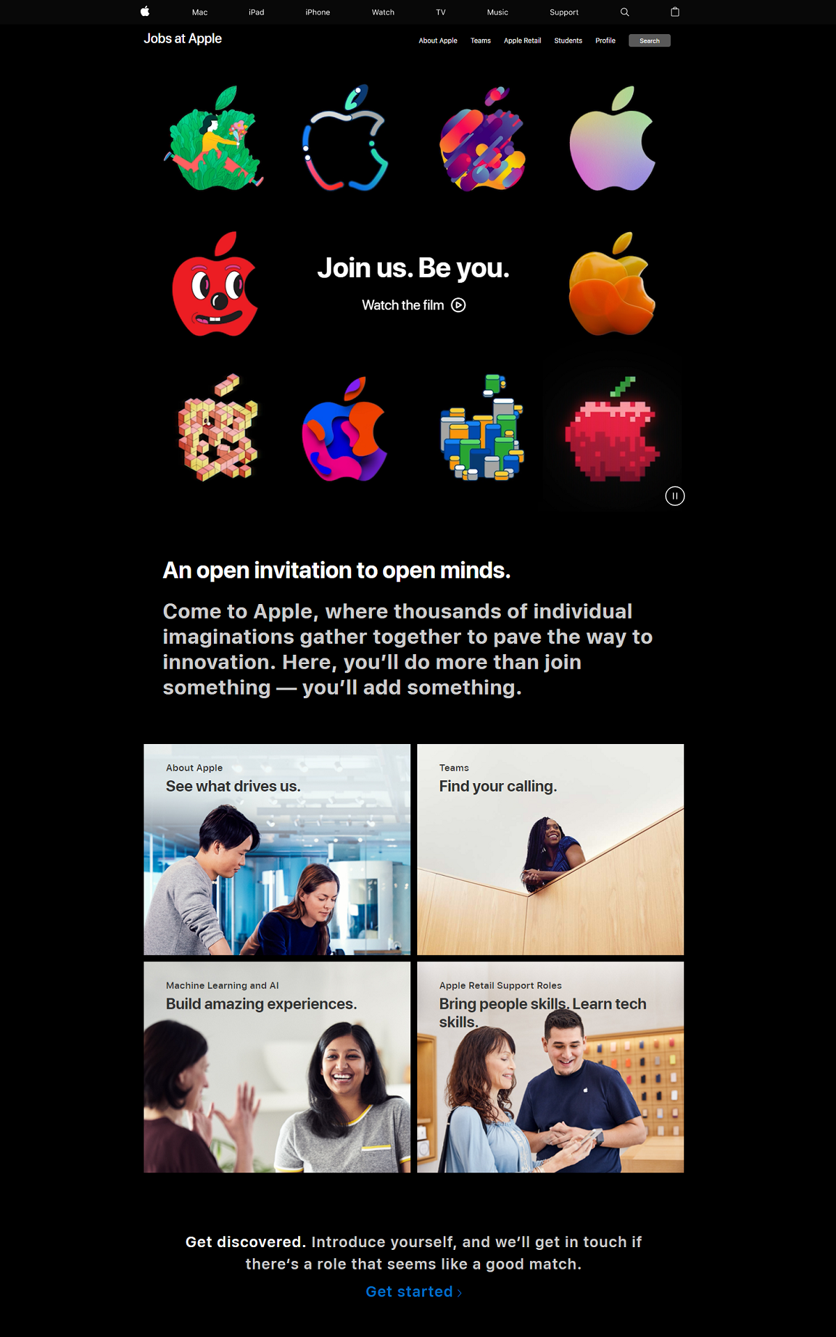
Apple
- Candidate Headline — They use “”Join us. Be You.”” (not just the common approach others might take (e.g. “”Apple Careers”” or “”Work for us””).
- Strong Video Just for Candidates — Their employer branding video link (also front and center) is on-message with Apple’s “”Think Different”” (be yourself) theme.
- Consistent Color Scheme/Font — The black background really makes things pop.
- Creative Use of Logo — They have different version of their logo (some out of shapes, others out of food, etc.). You might think that only Apple can pull this off but why couldn’t any company do this with their logo?
- Conversational Copy — Their use of the words “”An open invitation…”” gives it a conversational tone while also feeling exclusive.
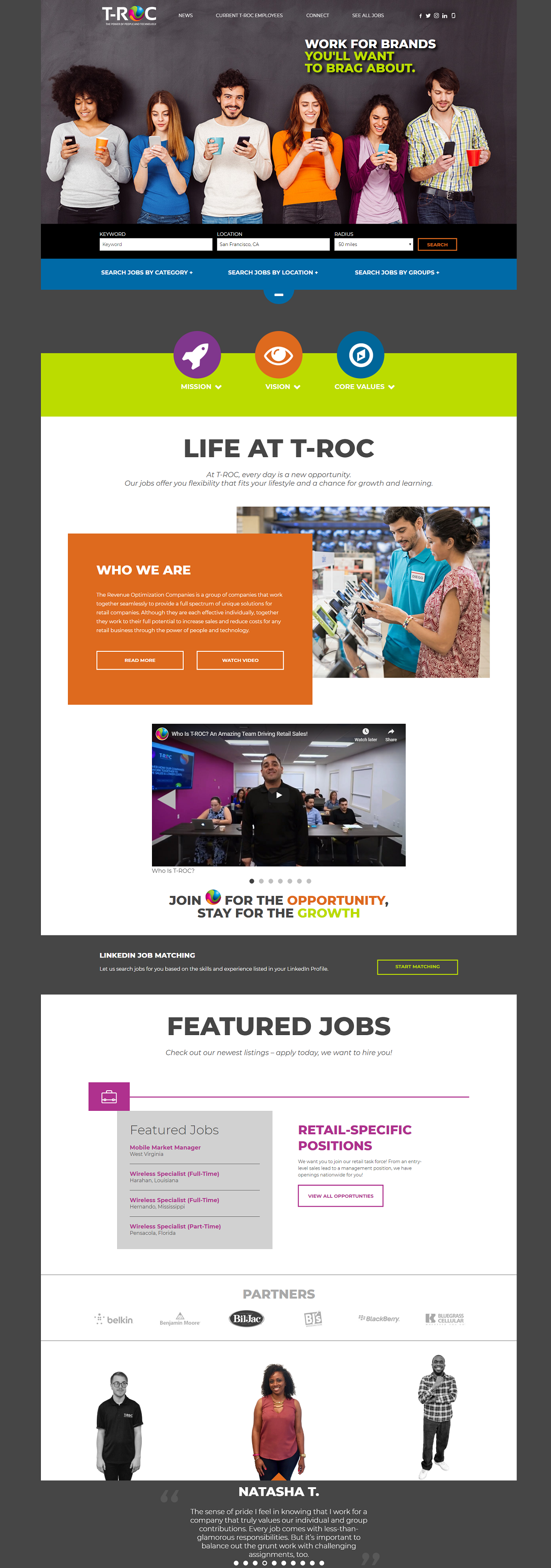
T-ROC
- Awesome/Happy first impression — Between the amazing hero image of smiling people and the rainbow colors, the candidate feels positive from the get-go.
- Great Headline: “”WORK FOR BRANDS YOU’LL WANT TO BRAG ABOUT”” (that beats the boring “”Careers’ or “”Join Us”” headlines many career sites use.
- Life at T-ROC — This section tells a nice story between the video and the imagery.
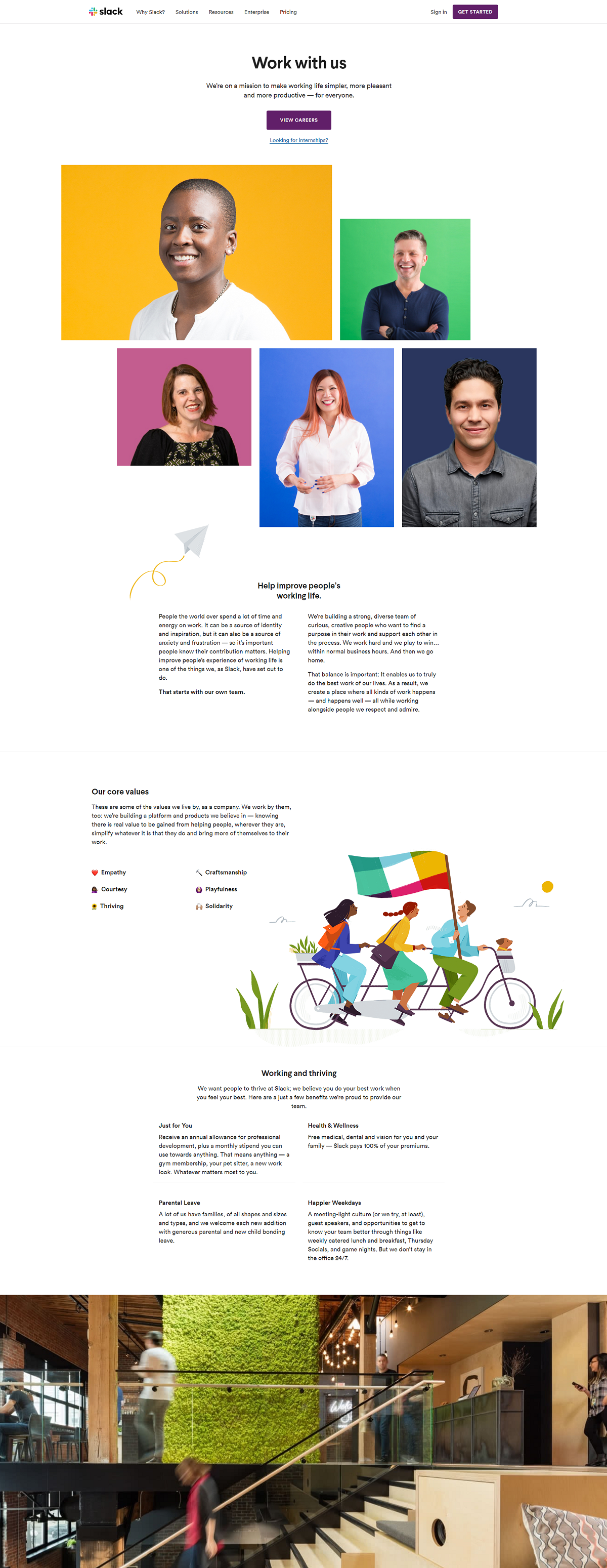
Slack
- Killer branding — Great use of company colors throughout the page.
- Clear values — They dedicate a section of their career page to values, which shows the candidate values are a top priority.
- Great pics of the workplace — Slideshow at the bottom shows off their awesome offices.
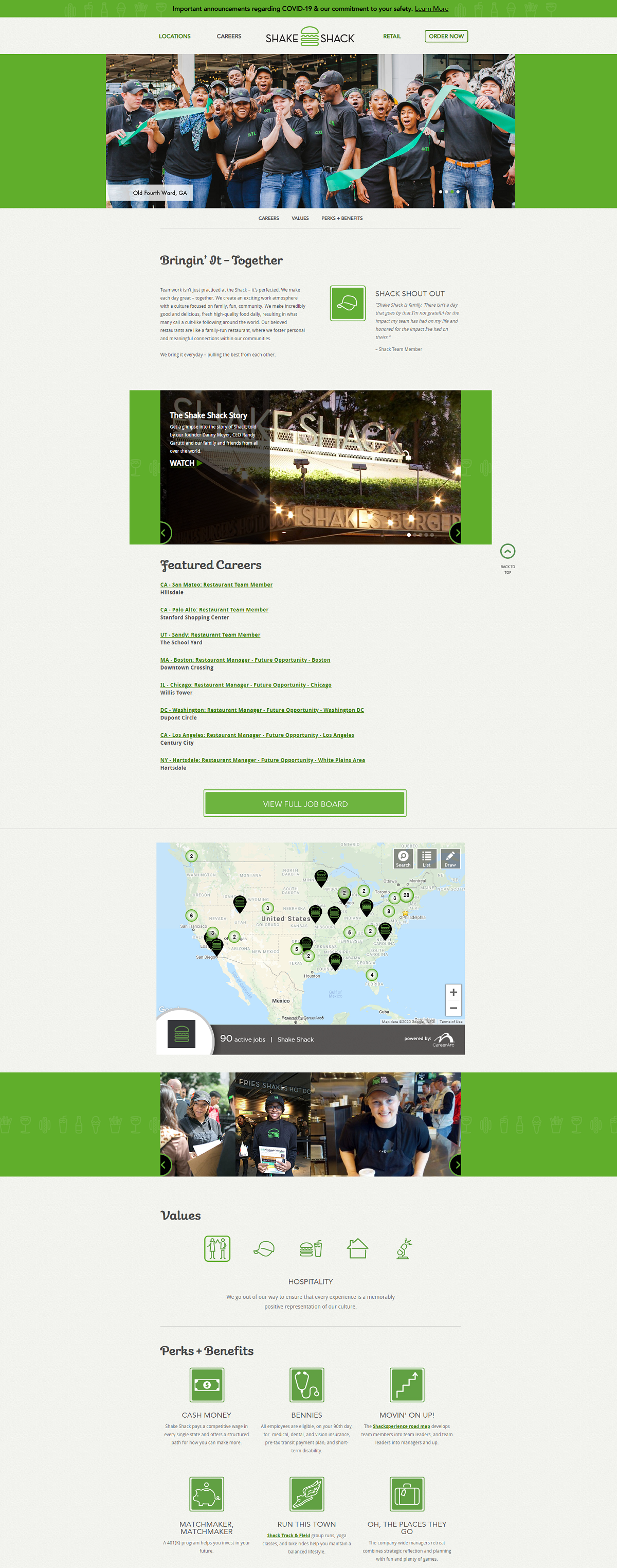
Shake Shack
- Overall Design — Simple and great
- Rotating gallery of pics of smiling team members from different locations (with the names of each locations)
- Strong Sub-Headline — They use “”Bringing it Together”” as a headline (always preferable to have a theme/mantra like this as opposed to a generic “”Careers at…””
- Video of the story of Shake Shack
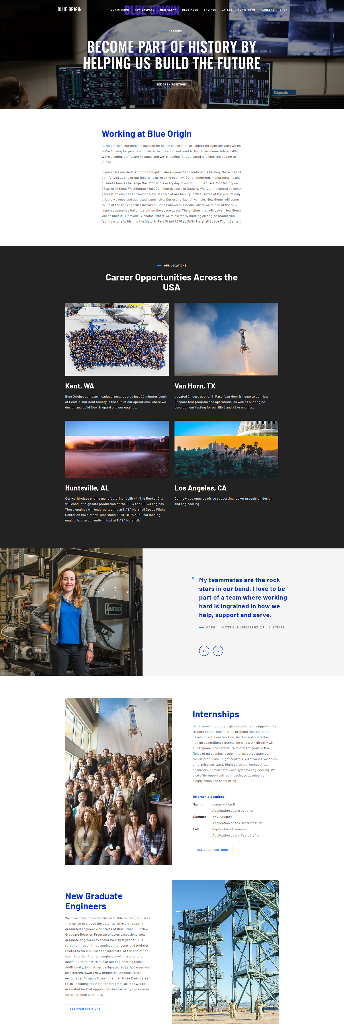
Blue Origin
- Strong headline (“BECOME PART OF HISTORY BY HELPING US BUILD THE FUTURE”) that looks like a newspaper/magazine headline — this will surely get candidates’ attention.
- Location-emphasis — Great pics of their core locations.
- New Grads/Internships — Clear emphasis on their Internship and New Grad Engineering programs.
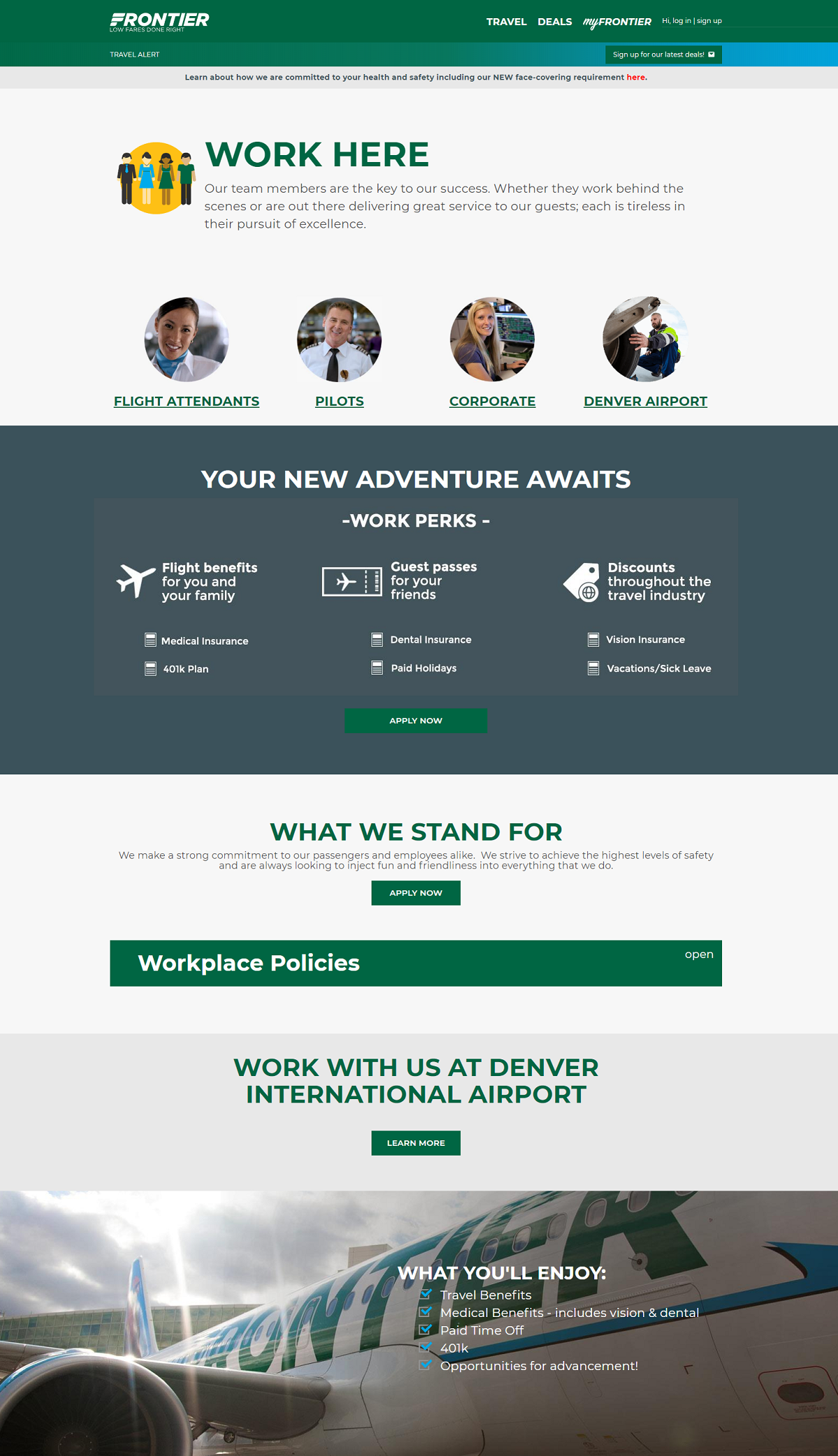
Frontier Airlines
- Clean Look — Short Headline with pics of the people in core roles/departments.
- Emphasis on Perks — Perks and benefits are a proven way to get candidates to take a closer look at working for you. If you take the time like Frontier does in outlining your perks (including any unique ones), great candidates will reward you.
- Clear Call-to-Action — The Apply Now button is front and center.
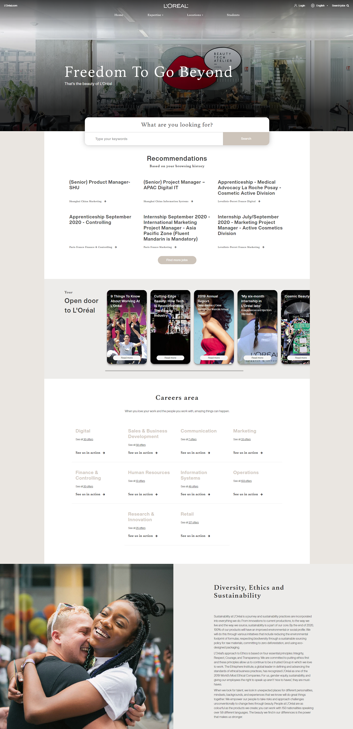
L’Oréal
- Great headline — “Freedom to Go Beyond”
- Hero Media — The pic with the lips and office space is unique and stands out
- Easy Search — Front and center, above the fold.
- Job Recommendations based on browsing history
Why I wrote this
Company career pages are an important part of your digital recruiting strategy. The goal is to attract and engage candidates and to move them onto your job openings. Ongig’s Career Site Builder helps employers create awesome careers sites with drag-and-drop builder, artificial intelligence-based search, instant microsite pages and dynamic job descriptions.
