Landing pages can be the make or break of your lead acquisition strategy.
For all of the social media ads or Google Ad campaigns that you create, if they lead to a landing page that doesn’t convert, you’re simply throwing money away. A landing page is essentially a page that a potential customer lands on after they click on an advertising effort. Different brands go about using landing pages differently; some will direct to their home page, a product page, or a “contact us” page, whereas other brands will link to a unique landing page for a specific campaign.
A post-click landing page is a standalone page and aims to convert the customer without them navigating away from the page; it’s essentially an entire website condensed to convert within a scroll. If a brand directs to a home page, then they’re happy for their customer to navigate throughout their website and rely on other areas of the site to convert. In this case, the brand will most likely be running top-of-funnel/brand awareness advertising.
The stand-out landing pages below are a combination of homepages that have been used for ad campaigns and standalone landing pages. You’ll find a collection of design features, conversational sales techniques, content inspiration, and much more. There’s no right or wrong answer here, but these landing page examples should inspire your own landing page designs, content, and conversion tactics.
This landing page example is a homepage and a click-through from a Google ad campaign. So what’s great about this particular example? “Holded, a business operating system for modern companies.”
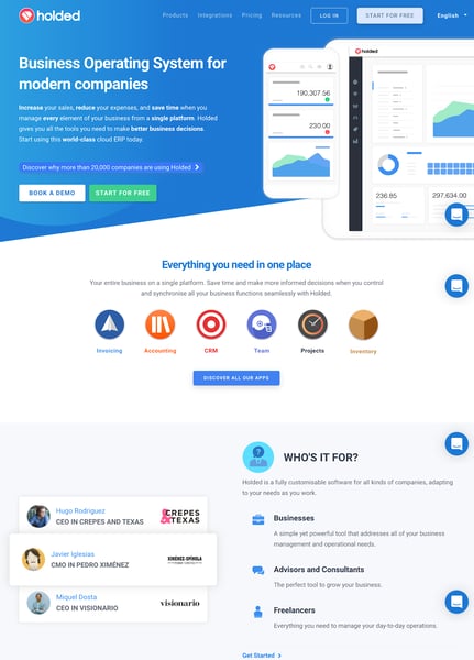
Reviews are essential in converting online sales. Plus, reviews from senior roles within relevant fields are more valuable. Holded has used reviews from CMOs and CEOs to give their product more weight.
Analyze customer interactions on your landing page with a tool like hotjar. In the “Who’s It For” section of this LP, Holded is qualifying early stage leads by appealing to: Businesses, Advisors/Consultants, and Freelancers. By using a heat-mapping tool, they’ll be able to track every user’s click and interaction within each of these sections and direct their marketing efforts towards their needs in the future.
Let’s go back to basics. Take yourself to an ice-cream parlour and ask a staff member for a taster. Even if you don’t like that first flavour, the chances that you’ll walk out that parlour empty handed have completely changed. Get a product in the hands of the consumer, let them have a taste of it and they’re that much more likely to invest in it.
“Typeform, engaging and conversational forms & surveys, that give data.” Typeform has used their product page for this particular brand word ad. Why this landing page example?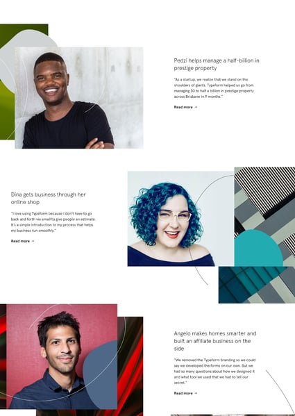
Not only is the landing page itself perfect on desktop, tablet, and mobile, but it’s also aware of who it’s addressing. Typeform knows they’re appealing to businesses and businesses know they need to be mobile ready. By 2021, it’s expected that 51% of online purchases will be made via mobile. Showcasing your product is mobile-ready is a huge win and something to be considered for the top of your own landing page.
Typeform knows the power of good storytelling and use it wisely in this particular landing page example. They’ve turned their consumer reviews into engaging short stories.
You’ve probably heard it before but let’s say it again. Think video! Use video in your messaging, and consider other forms of content to help drive your product home.
“Slack, the smart alternative to email.” Slack has created a great landing page example for a couple of reasons. As well as some of the landing page tips already shared above let’s explore some more.
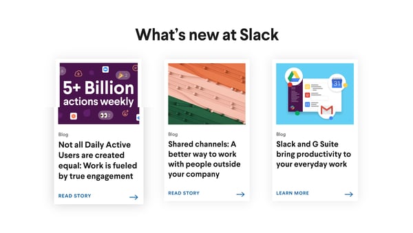
CTAs need to be thoughtful. Just because your landing page has more of them, doesn’t necessarily mean it’s more likely to convert. Slack has added four main CTAs to their landing page; these are clear buttons, and the eye is drawn to them with the colour and design used. The actual page is scattered with various other CTAs. If the customer needs a little more convincing, they’ll read on and be drawn in by other CTA buttons.
Slack has incorporated their unique selling propositions (USPs) into the body of the landing page. They’ve presented USPs not only as selling points but as action points as well. Every USP comes with a verb of sorts: “replace,” “break out,” “make the change”. They’re already encouraging customers to use the product before they’ve bought into it.
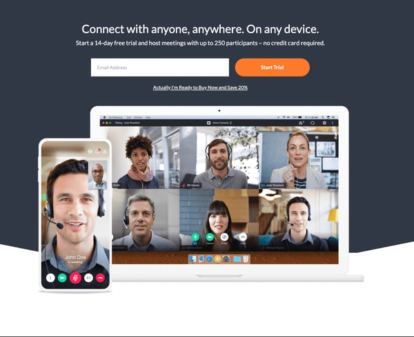
“Skype makes it easy to stay in touch.” This is a great landing page example for its streamlined user experience. Skype has carefully considered how they want their User to interact with the page and aim to spark joy from the ease of interaction.
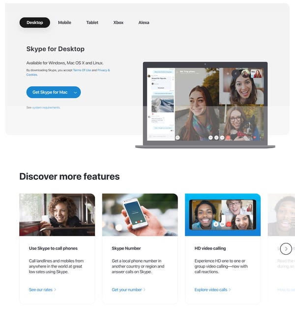
Content needs to be in bite size pieces. Don’t overwhelm your reader with large parts of text or information. Break up your landing page with clear titles, bullets where possible and blocks will be easier on the eye.
Scrolling features are a great way to break up the direction of your content and to bring a new way to engage with your page.
Colors are essential in not only visual design but they have a huge amount of psychology behind the emotions they evoke. In this example, Skype used blue, which is proven to provide a sense of security, stimulates productivity, and builds trust.
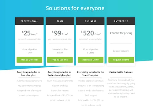
“OneRecruit, Recruitment by the hour.” OneRecruit, a bi-product on OneCoWork are showcasing a landing page design unlike one we’ve seen so far. With a much smaller brand awareness they need to introduce their brand alongside their product as clearly as possible, so let’s take a look at what they did.
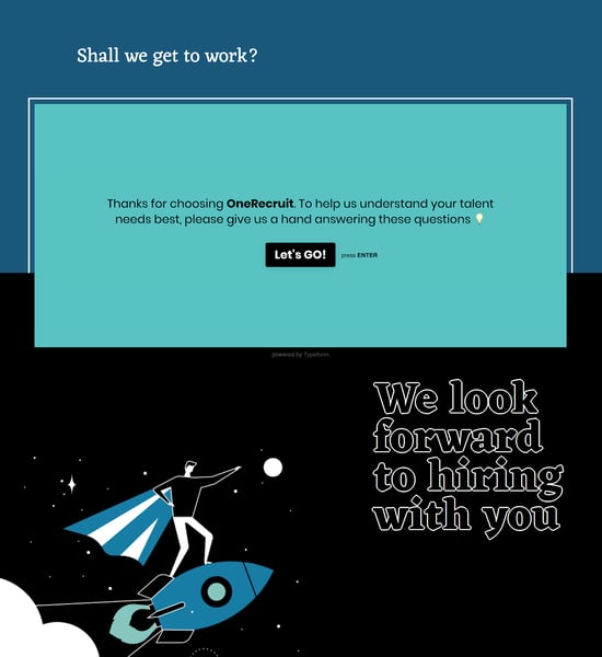
OneRecruit has used two pieces of marketing automation software on their landing page. With the use of a conversational marketing bot and the involvement of a (previously mentioned page) Typeform. They’re automating their lead acquisition process and appealing to as many customer preferences as they can.

If you have a fixed cost and are not a premium product then displaying your price plans up front will reduce drop off rate further down the line.
“Hive, powerful project and process management software.” Alongside Hive’s sleek design and color palette, they’ve incorporated something that we've yet to see. It’s one thing getting your user to sign up and start using your tool, but how can you make that process easier?
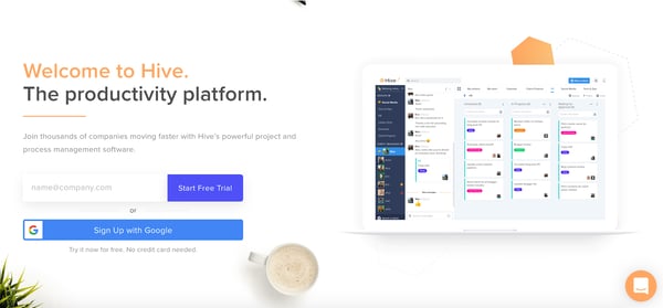
Whereas other landing page designs have given the option to sign up by creating an account, Hive has introduced the sign up with an existing account that most of their users will already have. Sign Up with Google! It’s less work for your user and makes getting a trial version of Hive that much easier.
“From finding prospects to serving customers, Hootsuite helps you do more with your social media.” Hootsuite provides a great landing page example of how you can use data to steer your marketing efforts.
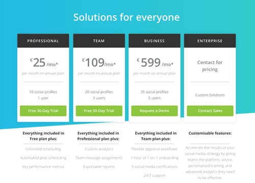
Above, you’ll see two brand name search landing pages from Hootsuite. Notice anything different? That second price plan looks a lot more appealing.
We’ve looked at the importance of CTAs and their placement. Now, let’s look at their wording. Hootsuite knows that the user is already “interested” in the page, so instead of pushing the user to compare plans the second time around, they try to get that product in hand and ask me to start a free trial.
“Loomly, build a successful brand with you team.” Your value proposition needs to be prominent in any good landing page; how you display that value proposition is entirely up to you. If you’re in a relatively crowded market like Loomly is, then don’t be afraid to go up against your competition.
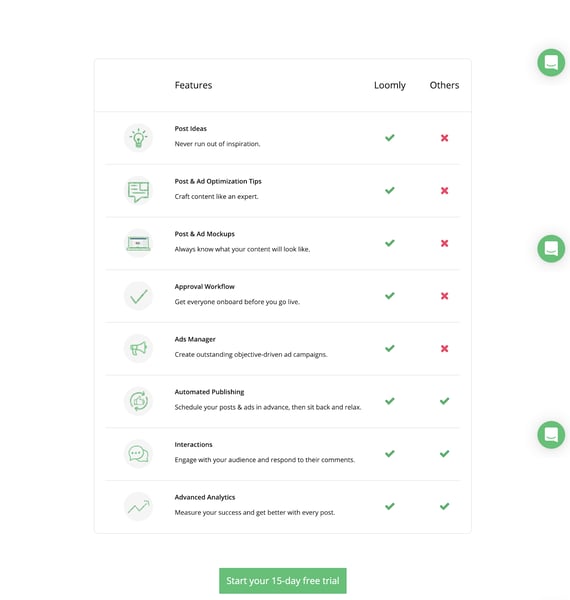
Don’t be afraid to compare your product alongside others in your landing page design. Checklists are a really clear way of doing this; they not only help you convince the user that you’ve got what the competition has (at a hopefully better rate) but that you’ve also got USPs too.
“Sendinblue, make your business take flight with the complete sales and marketing toolbox.” Stories are important to us, storytelling is in our nature and any form of great marketing is done via great storytelling. Tell stories as and when you can; they don’t always need to be so obvious.
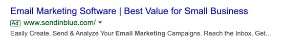
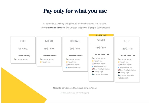
Sendinblue has done a great job with the title description of their google ad. Their text reads: “Best Value for small business”. This ad then clicks through to focus heavily on the value of the product, giving an array of plans for different size businesses.
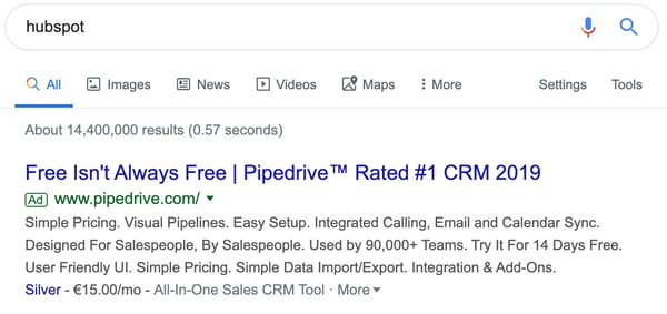
“Pipedrive, the first CRM platform made for salespeople by salespeople.” We’ve looked at comparing yourself to the market and your competition in general. Now let’s look at how you go for your competition, taking no prisoners.
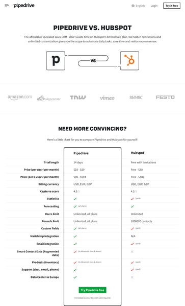
Pipedrive has created a landing page for the search term “HubSpot”. Brands bid against their competitors all the time. What Pipedrive has gone on to do is the next level. Pipedrive has called out their competition. They’ve laid all of their offerings alongside HubSpot’s as well as “shamed” HubSpot for selling hidden restrictions. So, if you’re going after your competition so aggressively, be sure to do your homework and present your findings honestly.
“Freshdesk, an Omnichannel, AI-driven or Self Service solution for customer service.” Freshdesk has managed to put the professional into playful.
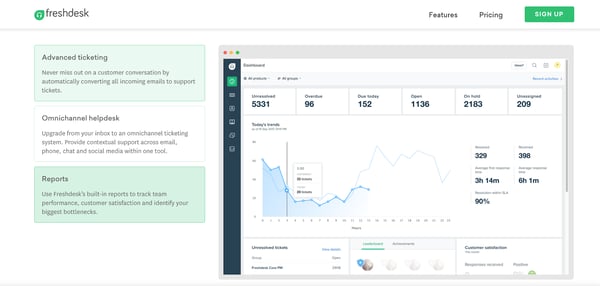
Just because your landing page is playful doesn’t mean it’s unprofessional. Freshdesk has made their landing page interactive. The user is able to click on the area they are most interested in and the image will change to what the user wants to see. This not only helps Freshdesk understand what their users’ needs are, but it also makes for better UX as there’s less scrolling. Plus, this technique keeps the user actively engaged with the landing page content.
“Shopify has everything you need to build an online store.” This landing page example is perfect for limiting the user’s options and giving a higher chance of signing up.
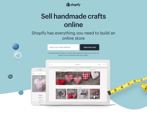
Getting that all-important email with just enough information. Shopify have asked for the email at the top of page, it’s one of the first and only actions a user can take.
“Gotomeeting, professional online meetings.” This landing page design is a great example for keeping things concise as well as celebrating diversity.
Be as diverse as possible across age, gender, nationality, you name it – your landing page should include as much diversity as possible. Be concise. Just because a landing page is longer doesn’t mean to say it’s better. Gotomeeting has been so concise that with one swipe you can reach the bottom of the landing page. If you can do the same without cutting out anything that may affect an acquisition, then do it.
“Intercom, Qualify leads, grow your pipeline, and speed up customer resolutions with Custom Bots.” We’re heading to an industry leader to look at chatbots for marketing automation done right.
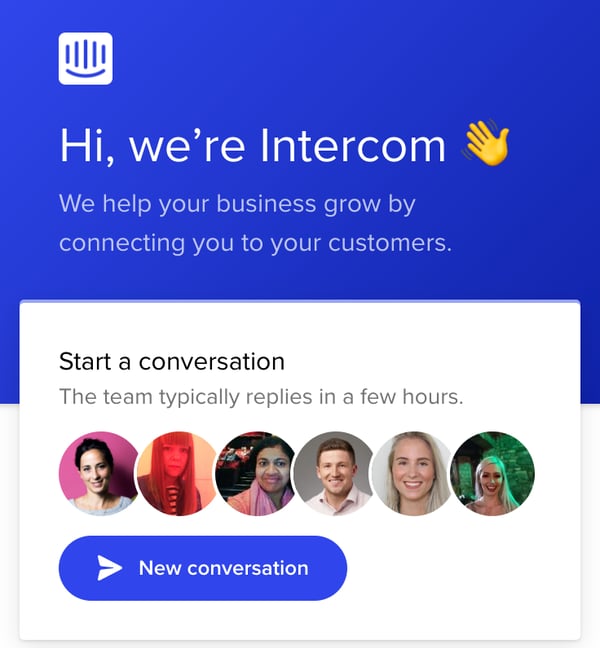
Conversational sales is a huge trend in marketing initiatives, and is certainly following through within landing page designs. Intercom has incorporated a custom chatbot to help you find answers yourself, or if you can’t find the answer, give you a chance to live chat with a rep. Two things they’ve taken the extra step with are: putting a face to a name and managing expectations.
“People HR automates the HR tasks you hate.” People HR has managed to incorporate a lot of the best landing page examples we’ve discussed within one page. However, we’ll focus on one thing in particular with them.
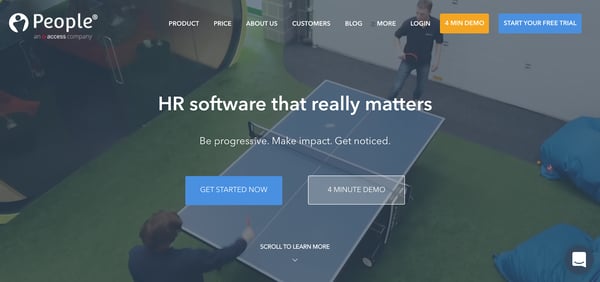
Try to demo your product whenever you can. These demos are best run by your sales or customer success team, can be recorded and should really sing about your product’s USPs. One thing that People HR has done differently is managing expectations by giving the demo length within the CTA. Time is money, so use your customer’s time wisely and they’ll respect you for it.
We hope these landing page examples will help you craft your own landing page designs in the near future. We’ve hit on a lot of points, so take the points that resonate best with your brand or product and go from there. A few things to keep in mind: design, efficiency, value propositions, content, reviews, marketing automation, and CTAs are all essential components of an excellent landing page.
Learn all of the industry tricks to mastering design when you go into creation mode for your landing pages. See G2's graphic design hub for inspiration and guidance!


Digital marketing is an essential part of brand promotion.
 by Adelina Karpenkova

Landing pages can be your business’s greatest boon or a complete waste of time.
 by Piper Thomson
Designing real estate landing pages is your secret weapon to increase your conversions like a...
 by Marilia Dimitriou