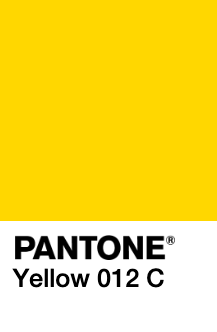
Yellow.
Imagine how many times a designer and printer have to go back and forth until the yellow that the printer produced was the exact yellow in the designer’s mind.
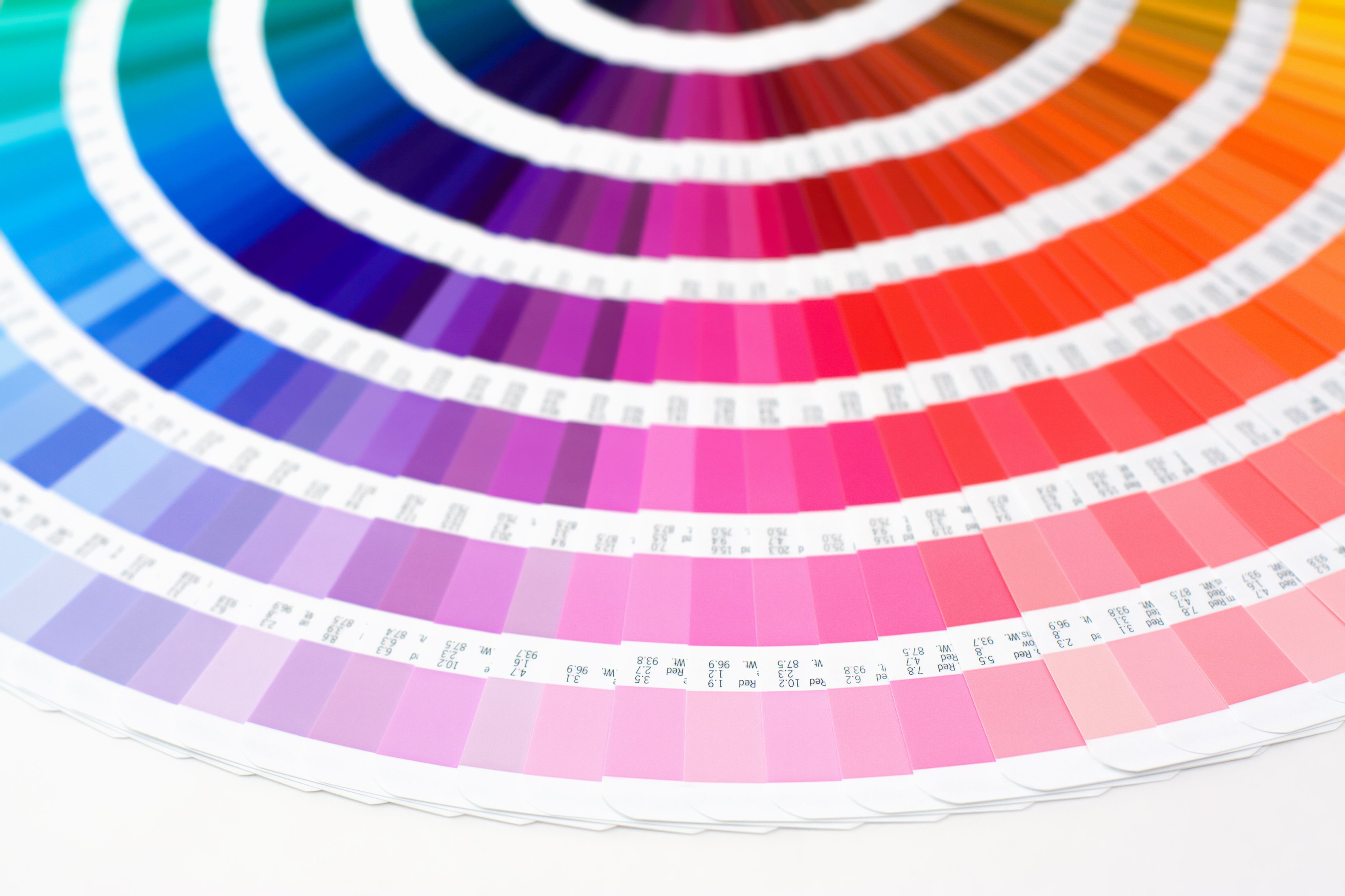
We have a seemingly endless amount of colors to choose from and a simultaneously limited vocabulary to describe them.
This problem is tough for everyone, especially graphic designers. If a client points to the sun and says “that’s the color yellow I want my ad design to be”, it’s hard to be sure you perceive that color in the same way.
It’s like saying something is heavy; how heavy do you really mean?
Thank goodness for scales. And thank goodness for Pantone.
Before Pantone, every printing company had their own color guide; “yellow” was printed differently depending on how each individual ink company interpreted that color to look. Some yellows were darker than others; some were more orange and some were more green. And it was never exactly what the designer had in mind.
In 1963, Pantone (meaning “all colors”, combining pan and tone) developed the first color matching system. Thanks to this system, graphic designers can see exactly what “yellow” would look like on paper and provide the printer with the Pantone number to make sure that they got what they wanted.
Source: Pantone
For the first time, color consistency existed for designers, printers, ink makers, and their clients. If the client chooses “yellow”, the designer can pass that choice on to the printer who orders that exact ink color, prints with that color, and provides a final product that matches the client’s needs.
This isn’t just great news for creatives looking to please their clients with one-off projects. Brands can also finally have color consistency across all of their marketing materials from blimps to billboards, no matter what agency or freelancer they work with, no matter where in the world they’re located.
Talk about a miracle.
Pantone is now used universally and recognized as the world’s authority on color.
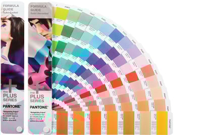
The Pantone Matching System (PMS) is the color standardization system that assists in color matching and identification. It is comprised of 1,867 solid colors. The majority of the colors for graphics are assigned a three or four-digit identification number followed by the letters U, C, or M. These letters represent paper stocks “uncoated”, “coated”, or “matte”, respectively.
With these variations, designers and users can see what their chosen color would look like on each of these different kinds of papers. Some colors don’t look different at all when placed on different kinds of papers, while others look worlds apart from one another. If you’re using a Pantone color, make sure that you specify which version you’d like to be printed by including the appropriate letter.
The Pantone Matching System is comprised of 1,867 colors that are created by combining 13 base pigments.
Source: Pantone
All of these colors can be found on Pantone’s website or in their printed book, which is a more reliable (and more expensive) visual resource.
When a company decides on their desired color(s), they can send their logo or asset designs to a printer, along with the primary Pantone number to ensure that their materials are being printed in the exact color they want.
Style guides are one of the best ways to make sure that employees in the same company are using the same elements consistently throughout their marketing materials and website. Pantone numbers can be included in a brand’s style guide so that employees of the company who want to design additional materials can use the accurate colors to remain consistent with the original designs.

Printing with Pantone can get expensive but it’s often worth it, especially for big brands who can’t afford inconsistency.
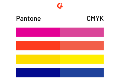
We already have a color system for printing: CMYK. Why do we need another system?
CMYK uses four plates (cyan, magenta, yellow, and black) to print out the desired color. CMYK color mode is what traditional, in-home printers use to print a wide range of colors.
However, the desired color has a chance of coming out a little differently each time it prints, depending on the calibration of the printer. For example, the green you intended to print may come up a little lighter than expected on some occasions.
| DEFINITION: In printing, calibration refers to the alignment of inkjet cartridges to the paper being printed on as well as the alignment of the cartridges to one another. Without proper alignment, printing quality decreases. |
If one copy of a document is being printed, this inconsistency doesn’t make much of a difference. But for a brand printing 10,000 business cards for their employees, “close enough” won’t cut it.
Pantone provides designers with security.
Pantone doesn’t combine any colors during the printing process; it is the color being used in the process. It’s much more pure than CMYK, and the difference is noticeable.
Pantone base inks are carefully mixed first to create the intended color, then put onto one plate to be printed on a special machine that has to be prepped for each job. Calibration no longer becomes a problem because there are no other plates to calibrate with.
Pantone printing is best for large projects with consistent, pure colors while CMYK printing is better for a mixture of different printing jobs.
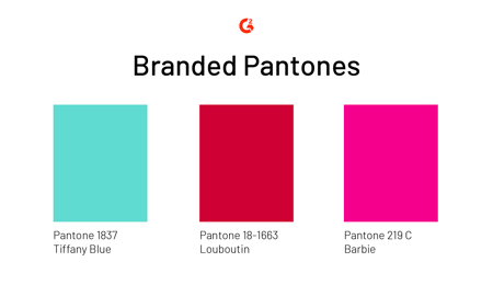
If your brand doesn’t have a custom color, are they really a brand? Probably. But some brands have really taken it to the next level and hired Pantone to make their own custom color. The price ranges depending on the request, but that doesn’t mean companies don’t cash in to make their brands pop.
Even Jay-Z has his own Pantone color: a shade of blue with a top-secret name.
But not all brands keep their Pantones classified.
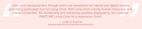
Pantone’s Color of the Year has taken place for 20 years. To select a color, Pantone’s experts look for influences among different mediums, from fashion and art to socio-economic conditions and new technology.
This year’s color? PANTONE 16-1546 Living Coral.
Source: Pantone
You can read more about Living Coral on Pantone’s Color of the Year page.
With over one thousand pure colors to choose from, Pantone provides the world with the type of consistency that designers once only dreamt of. Pantone is like a promise: the color you choose in the beginning is the color you get in the end.
Using Pantone is your safest bet when engaging in graphic design and marketing.

Yesterday was sunny and 85 degrees. Today, it’s a cold, windy, and rainy 54 degrees.
by Daniella Alscher
Standing out from the crowd is a great feeling.
by Daniella Alscher
Writing a summary of one thousand pages is hard enough – how are you supposed to summarize...
by Daniella Alscher