
Rebranding is undertaken for many different reasons; when a company is going through a big period of change, is coming out the other side of a scandal, or taking the advice of their marketing agency. Whatever the reasons, it’s a bold move for any team to take on.
Logos are iconic for many reasons, including that they become synonymous with products, feelings and, in some cases, an entire generation. Though a logo only forms a small part of a brand, when changed without warning, or without the right communication strategy, it can dramatically impact the perception of a consumer and, if not well-received, takes a considerable amount of time to get used to.
In this article we explore 5 of the most iconic logo changes of the last 10 years and the impact they had on global brands…
Zara
You may remember this one from February of 2019. Perhaps only the die-hard Zara fans were as devastated as the designers who took to social media to heavily criticise the new direction.
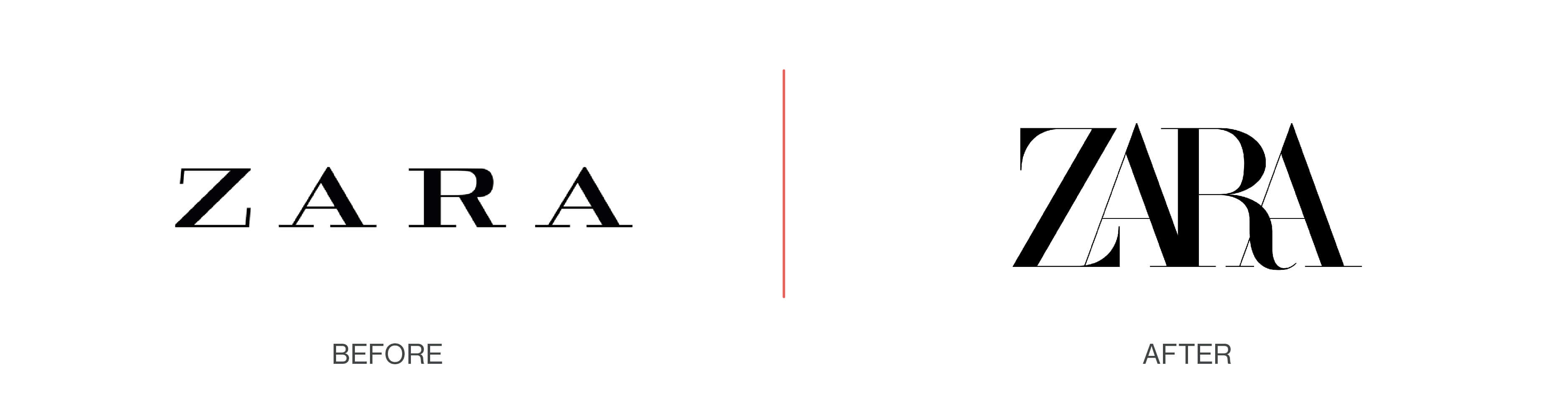
Traditionally, having letters overlap would be considered a huge design faux pas, but as French agency Baron & Baron have shown us, not playing by the rules makes quite the statement. The agency is the creative brain behind Dior and Maison Margiela – both known as high-end, luxury fashion designers.
Zara is very much becoming the fashion house of the high street, and no matter what your opinion on the logo change, it may just have helped them to solidify this position further.
At the latter end of last year, we saw Facebook give a very clear message as it launched its unexpected rebrand. While the Facebook social platform would remain as is, any sub-product associated with the brand would get its own new ‘grown-up’ Facebook stamp.
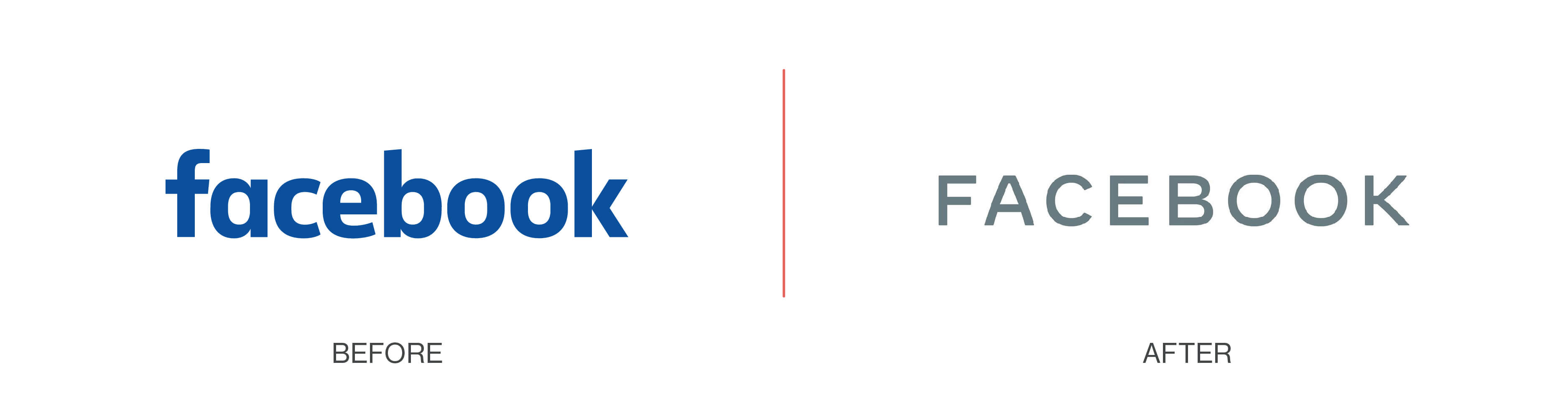
The purpose of the move was to create a visual distinction between the app we all know and use every day, and different areas of the business. The rebrand incorporates their own bespoke typography and capitalisation with rounded edges, making for a much more sophisticated look.
Facebook is very much a powerhouse in the tech world, but as it has moved into other ventures, it has required a strong identity that sets it apart from its social media application.
Another social media rebrand that sent shockwaves through the digital world was the rebirth of Instagram. Users could not believe their eyes when they opted to replace their retro polaroid camera logo with a flat, neon-coloured, gradient icon.
As with any rebrand, we can look back on this move in 2016 and comfortably say we’re all now at ease. But at the time Instagram faced widespread criticism that it was so simplistic that many from outside of the design world claimed they “could have produced something similar”.
The change was drastic, but absolutely the right move for them at the time. The irony is, after such a critical reception, many other brands have followed suit with stripped back, flatter logos in the last couple of years. Instagram took a risk as a trailblazer, and their gamble certainly paid off.
Mastercard
2016 was certainly the year of the rebrand, with Mastercard getting its first new logo and branding refresh in 20 years. The design keeps the iconic overlapping circles, but is completely modernised with the removal of the dated stripes.
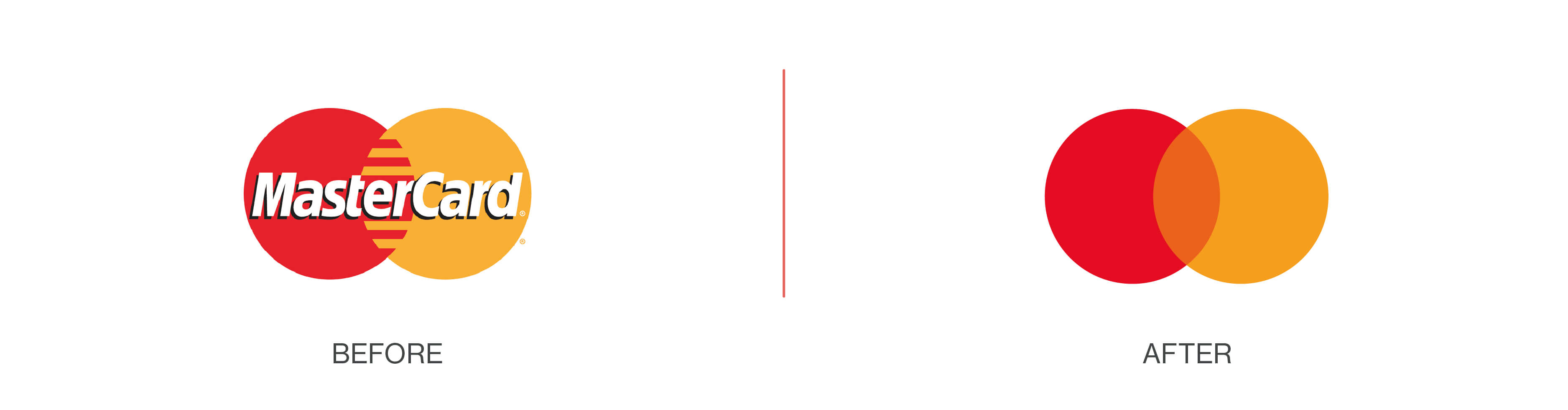
MasterCard’s team had foreseen the major transition into the digital age and created a new logo that would stand the test of time…That is, until January 2019. Just when the world thought MasterCard couldn’t get any bolder, they went against every branding rule in the book and removed their brand name from the logo, leaving behind only the red and yellow circles.
MasterCard opted for minimal in every sense of the word, and reconfirmed what we already knew – their identity is iconic enough that it needs no introduction.
Premier League
Consumers will always be your biggest critics when you make a big brand move, but having a global fan base of loyal football supporters opens you up to a whole new level of scrutiny. Another rebrand that took place in 2016 saw DesignStudio responsible for the clean, minimal Premier League logo fans have now become firmly accustomed to.
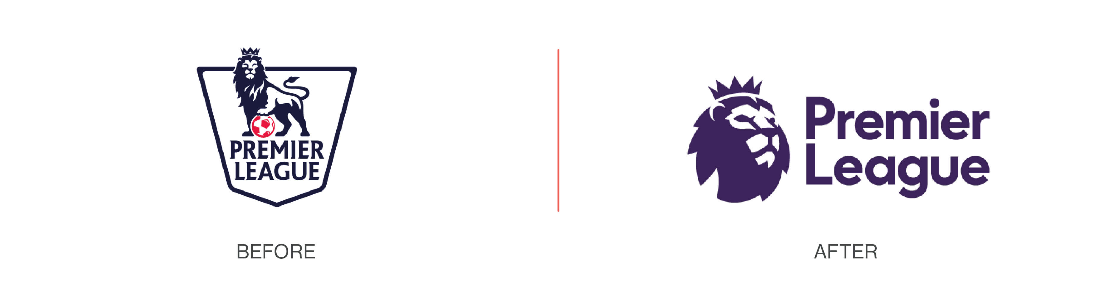
The initial controversy surrounded a miscommunication whereby it was rumoured that ‘Cecil the Lion’ would be removed in the new logo. The hearsay spiralled without being addressed properly and, when the rebrand did finally launch, there was Cecil front and centre.
Perhaps by keeping the rumours swirling, the agency helped to keep the new rebrand the hot topic of conversation. Free PR aside, if anything drastic is to change within your logo, you could consider a full communications strategy to make sure there are no surprises that could affect your reputation in the long term.
Conversely, if you have total confidence in your new direction (as Instagram did), a sudden launch could be just what you need to raise your profile in the media and cause a stir online. The dust will always eventually settle as today’s big rebrand becomes tomorrow’s chip paper.
Why are rebrands such a big deal?
A huge portion of global marketing budgets is spent on brand recognition campaigns. In doing so, brands build a rapport with consumers over the years that forms ongoing loyalty and relationships. If a change happens too suddenly, it can feel as though they haven’t been considered in the process. It can come as a shock and suddenly the brand they’ve known and loved throughout their lives is unrecognisable. Of course, most of the time it’s only a new visual direction, but psychologically consumers may feel uneasy about what to expect in the future.
The decision to rebrand is never taken lightly, particularly for global companies. A new logo requires a new set of brand guidelines, tone of voice guidance, colour palettes, fonts and more. Having these assets created is the starting point – the rollout across the globe is where the real work begins. Every piece of internal communication, be it email signatures, letterheads, business cards and more, needs to be overhauled. External marketing, websites, employer brand documents, interiors, signage and every piece of collateral needs to be replaced over a period of time.
On the face of it, it sounds like a costly task many would want to avoid. But the reality is, with BAM by Papirfly™, all of these things are made possible quickly and without fuss. If you would like to learn how a global brand rollout is made possible with a single piece of software, book a demo today or read more about BAM.