

Table of Contents
The combination of text content and design elements, including color theory for designers, makes any website a complete package. Audiences are naturally drawn to the visual design first, making it crucial for designers to present engaging designs.
Understanding color theory is key in this regard. In the following sections, we will explore various aspects of color theory and how designers can select the optimal color scheme to create attractive and captivating content.
What is color theory?
Color theory is a set of guidelines based on which colors are used to present appealing visuals. Every color carries an emotion/personality. It is for this reason brands choose certain colors as their identity. The colors reflect their brand personality.
For example, red is bold, energetic, aggressive, and strong. Popular brands like Coca-Cola and Netflix use red in their logo meaning to represent these emotions to the audience.
Importance of color theory in design
Why is it that you feel instantly attracted toward certain websites, and bored when visiting certain others? It is the design of the page that creates such an impression. Color is an important aspect of design and influences the emotions of the audience.
- Knowledge of color theory can help designers create visually appealing designs.
- Not only the color, but the combination with which they are used is also critical.
- Understanding the principles surrounding colors, the kind of emotions they evoke, etc., plays a great role in defining the success of your design.
Basics of color theory
There is a lot to learn about colors but first, the basics. Colors are classified as primary, secondary, and tertiary colors. These basic colors are significant to learn about color combinations and their use in design. They are the foundation for obtaining various hues of colors.
Primary colors
These are the colors that are not obtained by combining two or more colors. Red, blue, and yellow are the primary colors that bring out a myriad of other attractive colors.
Choosing a primary color for your design is a good choice, but you can explore more combinations too, by mixing the primary colors together. For example, blue and yellow produce green, the color of prosperity.
Secondary colors
These colors are obtained by mixing the primary colors together. Orange, green, and purple are the secondary colors. Let us see where they come from:
- Red and yellow make orange
- Blue and yellow make green
- Red and blue make purple
To obtain these colors, you should be using the pure form of primary colors without any tint of other shades, else will result in shades of the original color.
Tertiary colors
Mix any primary and secondary color, and you get a tertiary color. You can create so many colors by mixing these colors. But, the major tertiary colors are created by mixing primary colors with secondary colors that are nearer to them in the color wheel.
Some examples are:
- Red and orange make vermilion
- Blue and purple make violet
- Red and purple make magenta
While designing a page, the color wheel is your guide to choosing the best combinations to deliver an aesthetic appeal.
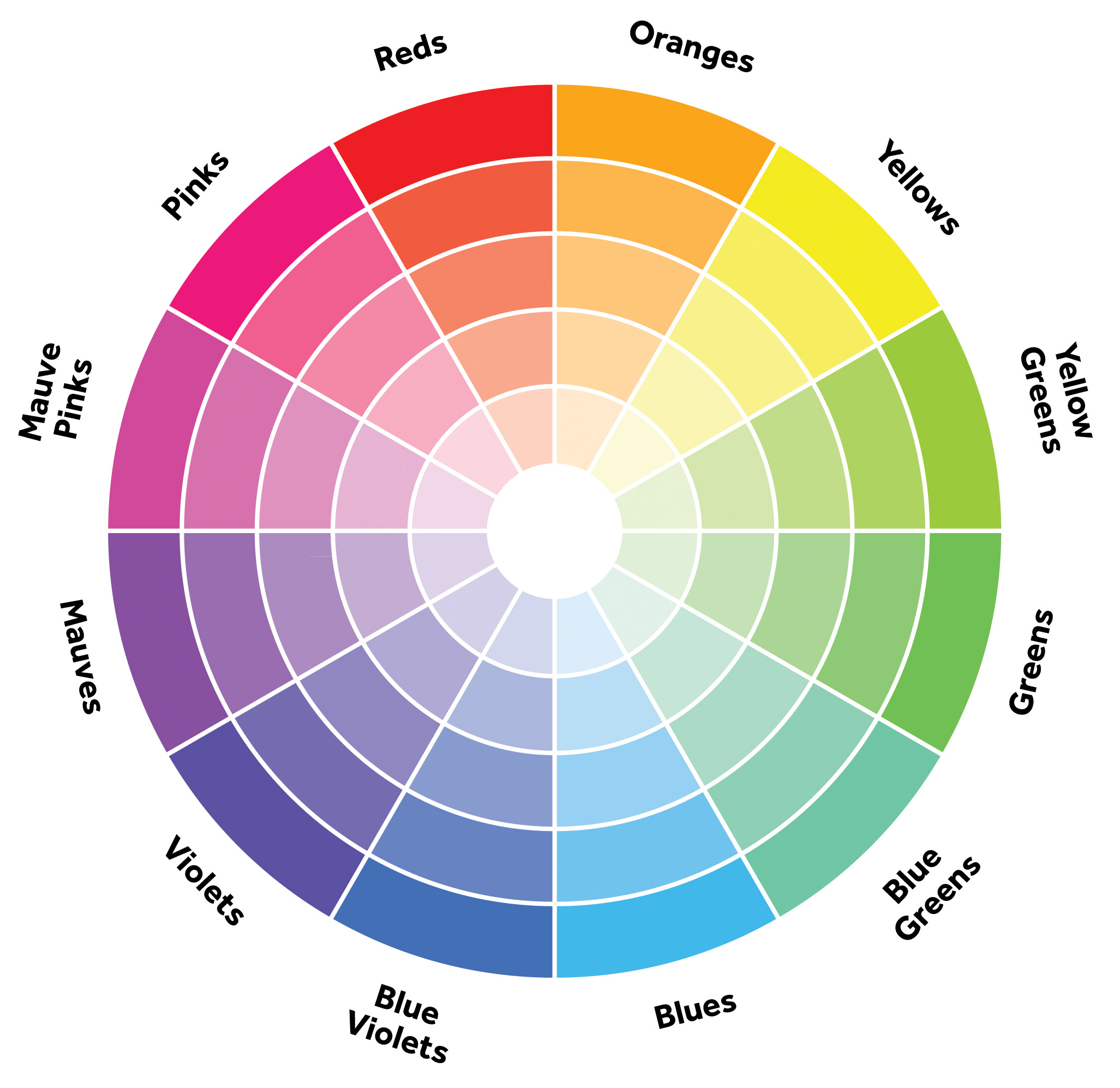
The concept of color wheel
The color wheel divides the spectrum of colors into 12 hues. Each color is represented along with its hues, tint, tone, and shade in the wheel. Designers can choose a particular tint or tone based on the design requirements and what they want the audience to perceive from the design.
Innumerable mix-and-match possibilities are available with the color wheel. The color wheel helps you enhance the look and feel of your design.

Speaking about the color wheel, you should learn about some concepts related to the wheel:
Hues- A particular shade of a color is called its hue. For example, all primary and secondary colors are hues from which many other colors are derived.
Tint- A particular hue, when mixed with white, produces a lighter version, and this is called a tint.
Shade- Shade is the darker version of a hue obtained by mixing black with it.
Tone- When you mix both white and black to a color’s hue, you obtain a particular tone of the same color.
Learning about these concepts helps improve the dynamics of your design.
Additive and subtractive color theory
To learn about additive and subtractive color theory, you should first know what RGB and CMYK are.
RGB
Red, Green, and Blue color codes are those used for electronic displays on the television or computer screen. It is based on the additive color model of light waves, where, by adding more colors, you get closer to white.
RGB is well-suited for creating web designs.
CMYK
You must have observed the acronym CMYK on your ink cartridges. It stands for Cyan, Magenta, Yellow, and Key (Black). This is based on the subtractive model, where you subtract more colors to get white.
Thus, the additive color theory is based on RGB, and the subtractive theory is based on CMYK. Designers use both CMYK and RGB for creating stunning digital images.
How can designers choose a color scheme?
Some tips to choose a good color scheme are:
Brand identity
The design of your page stands as your identity. The color scheme represents what the brand wants to convey. Choosing the right tint, tone, and shade of the color hue is important for this reason.
The color scheme is what sets a brand apart from its competitors. As each color carries a personality, it is important to choose the one that matches with your brand’s personality.
For example, Apple uses Apple Gray, Apple Silver, and Cultured White on its website. These colors convey sophistication, exclusivity, sleekness, and luxury. With extreme minimalism, it has been able to successfully convey its values through the color scheme.
Consider your audience
It is for the audience that you are creating the design. You should think about how the audience would perceive your design. The color scheme for the design should be appealing and deliver meaning at the same time.
This can be done by understanding the meaning of different colors. Proper research about colors and the preferences of your audience would help you decide on the perfect color theme.
White space
Overuse of colors without leaving some white spaces in the design may be overwhelming for your audience. Always consider the use of white space to give a breather. White spaces are the empty spaces between the different elements of design used.
The use of white space in the design is also helpful in highlighting the other colors. White spaces can deliver a good user experience. It creates a balance between the various colors used and attracts the attention of the audience.
Emotional appeal
Every color carries certain emotions. If you want to invoke a particular emotion in your audience, you should select your colors appropriately. For example, McDonalds’ has a color scheme of red and yellow. Here yellow is associated with happiness and is visible even from a distance. Red stimulates action and kickstarts the appetite of the audience. Being a food brand, it has rightly chosen its color scheme.
Seek inspiration from nature
Nature is filled with vibrant, joyous colors. If you feel lost and unable to decide on your color scheme, you should take inspiration from nature. The natural combinations can instill creativity in you to choose a color scheme for your design.
You can find many tones of green that can match with the earthy tones you wish to create. Even while choosing colors from nature, it would be great if you could match them with the brand value you wish to communicate.
Refer to the color wheel
The color wheel gives you warm and cool shades of colors to choose from. The reds and yellows are considered warm, and blues and greens are cool. You can choose a warmer or colder tone based on the mood you want to create through your design.
While choosing colors from the wheel, avoid too many combinations to keep your design clutter-free. Also, include whites in between to make the design more appealing.
Draft and apply multiple designs
This trial-and-error method of choosing colors helps to appreciate and select the best color palette for your design. You can draft and apply several designs so that you can come back at a later date to see if you still find it appealing.
You may be attracted to a color scheme while starting with the design, but the end result may not be as expected. This is because the digital screen is different from the color wheel where you only see smaller portions of tones. Review and find the best color scheme suitable to you before applying them to your design.
Conclusion
Color theory is a key aspect designers should consider, to create brilliant designs. Exploring various color palettes to arrive at the best one is a learning experience. Color schemes are chosen based on your brand requirements. There are some excellent tools like Adobe Illustrator that help you with designing. You could use them too, to create appealing designs and captivate the attention of the audience.
