

Table of Contents
Establishing the brand identity is an important aspect for every business to sustain in this competitive business environment. Brand identity involves various aspects, including how the visual appearance appeals to the audience.
This is mostly your logo, the styling of words, the colors used, etc. In this blog, we provide you insights into the main components of the brand style guide and some popular examples of top brands.
Main components of the brand style guide
1. Color palette
Every brand chooses a unique combination of colors to represent its name and logo. This is its identity. The colors used should be consistent to create a brand image. A slight change in the shade used may create doubts in the audience about the authenticity of the brand.
2. Logo
The logo represents the brand. Creating a logo involves a lot of thought processes, as it should be simple, recognizable by all, and should represent the brand well. The color used, font style, font size, space between letters, etc., are some components to be considered while deciding on a logo design. Also, it shouldn’t resemble any already existing brand.
3. Typography
Typography is the design element that gives your brand a distinct identity with the style and appearance of the text. It should have clarity and be appealing to the audience.
4. Voice and tone
Voice is the kind of language used by a brand to define its identity. This is not related to the visual aspect of styling. The tone of delivery conveys whether the brand is confident, knowledgeable, passionate, empathetic, rigid, etc.
5. Mission statement
Your brand’s mission statement is also an essential component of the brand styling. This defines the purpose and ensures that all your work is directed toward achieving the mission. The way you represent your icon or word mark speaks about your objectives.
10 Brand styling examples of popular brands
Here are 10 brand style guide examples from some of the most popular brand worldwide.
1. Walmart
Walmart is a very popular chain of stores with an easily recognizable logo. The popularity of a logo is dependent on the color, font, typography, illustrations, voice, etc. “Walmart Blue” is so integral with the brand that it has become its identity. There is no use of digital colors, textures or tints of shades.
The colors are ADA compliant. There are three types of logo representation that give more visibility to the brand. Bogle, the official font used is versatile and friendly and follow certain best practices as laid out in the styling guide.
You can learn more about the Brand style guidelines of Walmart here.

2. Twitter
Twitter Blue and White are the colors through which the Twitter logo is represented. The bird used as the logo also has specifications regarding its size, borders, use of text, etc. There is clear space around the logo, and there is no animation or alteration. There are no extra elements except the bird. The font used is Helvetica Neue Pro 75 Bold.
The background of the Twitter icon can be modified like circular, square or rounded square. Twitter maintains that the text used should be scaled to 100% of the size of the logo. Clear guidelines for spacing should be followed and no previous versions of the logo are permitted.
Learn more about the full Twitter style guidelines here.

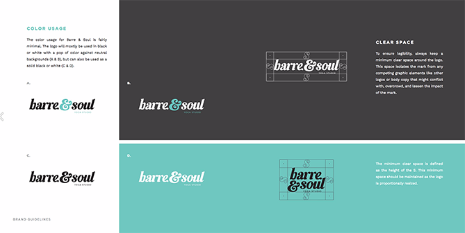
3. Barre & Soul
The style guide of Barre & Soul has a five-color color palette. It has defined the spacing, font for the logo, imageries used, etc. There are specific guidelines for typography, primary logo usage, and the space around the logo.
There are three aspects to the style guide by Barre & Soul: Retro, energetic and edgy. This is how the company wants the audience to perceive about them. A mood board that captures these words is also used as a part of the guide.
The words in the logo appear to be so close, yet is legible since a defined space is maintained around.
Learn more about the full Barre & Soul guidelines here.

4. Apple
Since 1976, Apple has been streamlining its logo, moving from the iconic rainbow-striped apple to a more minimalist design. Despite this evolution, the company lacks an official animated Apple logo.
The monochromatic logo that Apple has created is iconic. This is unique and has been the brand’s logo since it started. The color palette used is simple: silver, white and black. The size of the Apple icon is carefully chosen and is used the same way wherever it is represented. A free space is maintained around the icon without any text, graphics, or borders.
Nevertheless, the Apple community has stepped in to fill the void, creating numerous impressive animated logos. The "Jobs at Apple" page showcases these captivating user-generated artworks through a dynamic display of animated Apple logos. Techniques range from fluid animation to seamless morphing, including some of the most intriguing 3D logo animations.
The proportion of the size of the logo is characteristic of the brand and, if altered, will lead to distortion of the original icon. Apple's primary font is Helvetica Neue, and the secondary font is Arial.
Learn more about the full Apple guidelines here.

5. Netflix
Commencing with its distinctive animated "N" ribbon, Netflix's logo animation transforms into a barcode-inspired visual. The team initially conceived the idea by contemplating thumbnails of Netflix originals from a sideways perspective.
Utilizing a color spectrum and creating depth illusions are pivotal effects that captivate consumers, immersing them in a cinematic ambiance. The animated logo subtly conveys Netflix's evolution from its streaming-centric origins to its burgeoning role as a production studio. Netflix surely knows how to stand out when it comes to having an animated logo.
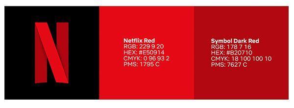
The company offers specifications for the size, font, color code, and spacing for its logo. The letter ‘N’ in the signature red color is easily recognized as Netflix in places where the brand is extremely popular. The brand also specifies the contrast ratio to maintain clarity while using the logo on a background.
In rare circumstances, Netflix allows the use of Black and White for its logo but this needs special approval from the brand team. When there is a partnership logo lock-up, the company mentions that the Netflix logo should appear first, there should be parity in the sizing and appropriate space must be provided.
Learn more about the full Netflix guidelines here.

6. Starbucks
Another popular brand that has a distinct way of styling has ensured to capture the viewer’s attention. Its style guide mentions how its core elements, The Siren and the wordmark, are placed. The Siren is placed separately without the wordmark to display it prominently. The green color palette used is iconic that the brand can be recognized even from a distance. The brand voice used is functional and expressive to captivate attention. The fonts used are Sodo Sans, Lander, and Pike.
Starbucks uses the green family of colors to maintain its brand identity. The primary Starbucks green along with the secondary greens is expressive. The illustrations it uses are a part of the legacy of the brand and keeps evolving with the trend.
Learn more about the full Starbucks guidelines here.

7. Spotify
Spotify has a simple and easily identifiable logo. The combination of green colors used here is typical of the brand. Spotify identifies itself with its logo and wordmark. The icon alone is used only if there is a space restriction. The default font used is Sans serif.
Spotify green is the primary color in the color palette and can be used with black, white and non-duotoned photography. On a black or white background the Spotify green is used, elsewhere only a monochromatic logo is used. The legibility of the logo is maintained with a restriction on the minimum height and the space between the logo.
Learn more about the full Spotify guidelines here.

8. Barbican
Barbican is an art learning center with bold typefaces and colors in its logo. The only font recommended by Barbican is Futura, and this keeps it apart. Their visual identity is only a wordmark and not an icon, as used in other brands. There are three wordmark sizes used. The headlines, sub-headings, and other information use different type sizes. The alignment of the wordmark is also specified by the brand.
Barbican’s principal funder is the City of London and the Crest appears in all of Barbican’s works. The size, position and color of the Crest is also specified for representation to the public.
Learn more about the full Barbican guidelines here.

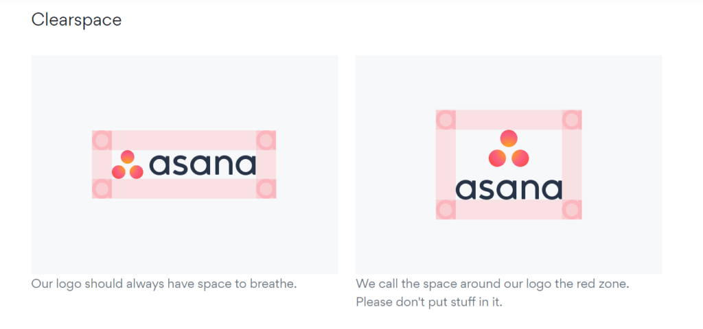
9. Asana
Asana, the project management tool, also has a simple styling guide. The logo has clear space to breathe. There are two types of representation: vertical and horizontal, depending on the space availability. The three dots in red are easily identified with the brand since it is a unique representation. In light backgrounds, the wordmark is used in black, and white in dark backgrounds.
The space around the logo is called the red zone or the breathing zone. The three dots are simple red and should not be replaced by emojis or any other forms of dots.
Learn more about the full Asana guidelines here.

10. Skype
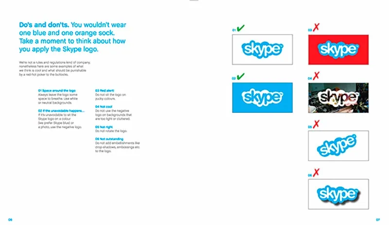
This popular video conferencing platform has a distinct logo with clear specifications on the style. Skype blue is the color used for the icon, and it is always in Chaletbook bold. It is always used on a white or natural background with enough space to breathe. The whole wordmark sits inside a speech bubble which is very unique. There are two logo variations, one for the print version and the other for online.
The logo is never featured on bold or bright backgrounds which makes it a pleasing one. Cluttering of the logo or reversing it from the background is not encouraged. In most places Skype recommends the usage of the logo with its strapline, "The whole world can talk for free".
Learn more about the full Skype guidelines here.

Conclusion
Your customers can easily recognize your brand by your brand styling. Grabbing the attention of customers is imperative to create an impression. You now know how top brands have captured the attention of customers through their style guides.
We hope it has provided you with inspiration to create your own.
