Did anyone ever ask for your advice then not take it? That’s just how your employees will feel if you ask them to complete a survey and you don’t analyze the results and report back.
Once you’ve put time and energy into creating a survey, don’t diminish the trust and goodwill you’re building by stalling in your response.
- Why is analyzing employee survey results hard?
- How to design your employee survey
- How to analyze your employee survey results
Why is analyzing employee survey results important?
Surveying your employees is a direct way to understand what they think of your business, the challenges they face, and the improvements your organization can make.
How effective these improvements are depends on how well you are able to interpret and analyze your employee survey results.
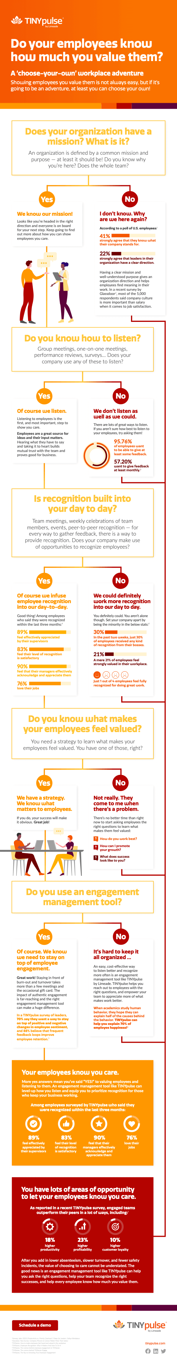
Unfortunately, most actions that organizations take aren’t very effective. In fact, TINYpulse research found that only 25% of employees think their organization takes very effective action on the feedback they provide.
Not taking the right action or ignoring employee feedback (even if it’s unintentional) can have real consequences for your organization.
For example, nearly 1 in 5 employees become disengaged when their company doesn’t act on their feedback. Low levels of employee disengagement not only affect productivity and profitability, it can also negatively impact your workplace culture.
Don’t let this happen to you. Use the feedback you receive to make data-driven improvements and share the results with your employees. By circling back afterward, you keep lines of communication open, building trust with your employees.
Why is analyzing employee survey results hard?

Analyzing survey data is often difficult because of how the survey itself is designed. The problem with most traditional employee surveys is that they contain many questions that cover a wide range of topics. They’re delivered once a year—and often get an indifferent reception.
Surveys have too many questions
The time involved and “bandwidth” needed to complete a survey are often overwhelming. This can skew your survey results. If you don’t have very many staff participating in your survey or they are rushing through it, your results may be less accurate, leading you to take the wrong actions.
Surveys have too many themes
With a large mix of question types in most surveys, the data can be hard to benchmark because you aren’t comparing “apples to apples.” It’s also more challenging to prioritize the improvements you want to make when there are a lot of areas pulling your focus.
How to design your employee survey
Analyzing survey data is often a tough job, but it doesn’t have to be. Planning ahead while designing your survey can help make it easier to analyze your results.
Choose the right survey frequency and length
Designing shorter, more frequent surveys makes it easier to translate data into meaningful and actionable insights.
Brief, frequent surveys yield digestible results.
In fact, the National Research Center found that the less questions you have, the higher your response rate and quality of your data will be.
Try to limit your survey to five questions or less so that your employees don’t get survey fatigue. This will give you the opportunity to run surveys more frequently than you normally would. It also makes it easier to quickly compile and analyze your results.
Ideally, you’ll want to survey your employees at least biweekly, if not every week. This ensures you have the most relevant and timely data. Act quickly on the results so you can further build trust with your employees.
Set goals and learn from each survey
Before every survey, set clear goals. What do you want do you want to learn from your survey? Why is it important to your organization and employees?
During your analysis, be mindful of the goals you set out to accomplish. Did the responses fulfill those goals? If not, what can you learn from the experience? This will help you ensure every survey is a success.
How to analyze employee survey results for actionable insights

Quantify the data
Quantified (numeric scores) results are a direct, meaningful way to express results. Everyone remembers numbers. This also makes it easier to compare data. For example, showing how different respondents answered a survey item as a percentage helps us better understand the overall trend.
Breaking the data down
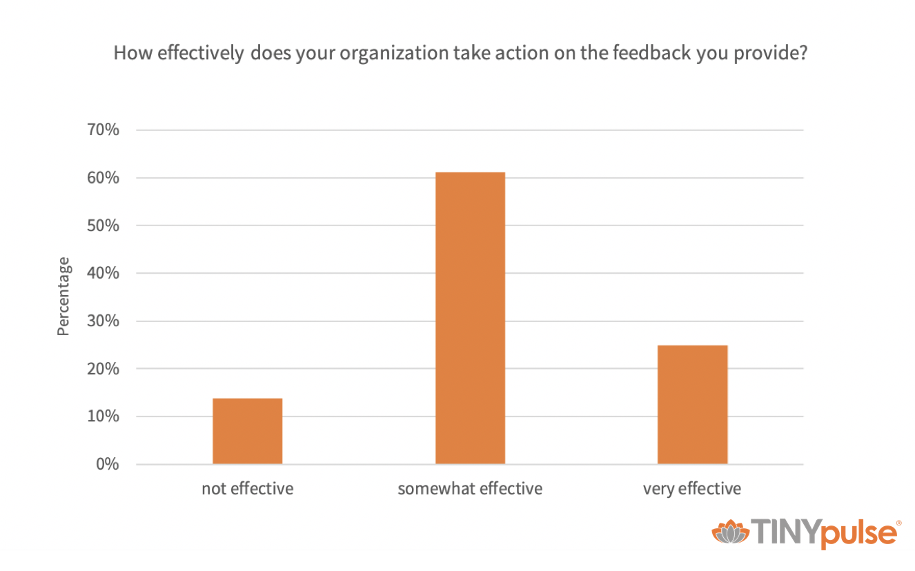
The employee experience is different for everyone. Segmenting your data by employee groups and demographics can give you more insight into the challenges specific work groups are facing. This will allow you to compare how different teams are doing and take action where it matters most.
Look for patterns and trends
Look for trends within your survey results. Often what's meaningful to one person may not be to another. When 80% of the respondents say they’re not satisfied with the paid time off policy, that’s telling. When a few staff members say they want an extra 15-minute break during the day, maybe not so much.
Are the responses consistent across the organization? Are there differences between FTEs and hourly staff? What about seasoned staff members vs. recent recruits? Asking yourself these questions will help you identify improvements that will have the largest impact.
Focus on qualitative responses, too
Don’t just look at the numbers. Make sure you give equal attention to qualitative responses. These types of responses are important because they are more in-depth than quantitative (numeric) data. It’s what helps tell the story.
Without context, numeric answers can be unreliable because they don’t take into account extraneous factors. A qualitative approach can capture motivations, thought processes, and attitudes.
For example, someone may rate something an 8/10 but have a valid concern/criticism preventing them from awarding a 10. If you’re going to get them to a 10, you’ll need to reach out and listen to their concerns.
A common challenge with anonymous surveys is being able to follow up to get that qualitative data. That’s why one of the most popular features of TINYpulse is the ability to send private messages to survey respondents. These private messages allow you to anonymously follow up with your respondents to have a deeper conversation about the survey feedback they leave.
Trust your instincts
When you’re doing data analysis, don't discount your personal experience and intuition. You are also a crucial part of your organization.
Ask yourself: Does the data make sense given company culture and circumstances? Objective analysis is smart but don’t discount your gut.
If there are discrepancies between your personal experience and your results, dig deeper. Consider sending an open-ended, follow-up survey or holding a small focus group to learn more about the data. This will help you better understand the big picture.
Benchmark your survey results

Benchmarking your results can help you better understand how your organization is doing and identify which areas to target for improvement.
When you are analyzing your survey data, there are three types of benchmarks to use: national, industry, and internal benchmarks.
National benchmarks
Benchmarking against the national average will give you an idea of how your organization stacks up country-wide. While these can be useful, out of the three benchmarks, it can be the most misleading because it doesn’t factor in industry or organizational factors.
Industry benchmarks
Industry benchmarks are particularly helpful because they allow you to see how well your organization stacks up against similar business. This accounts for factors specific to your industry and makes it more reliable than a national benchmark.
Internal benchmarks – benchmark your own results
Internal benchmarks are one of the most important ones to use because it lets you see how well your organization is doing over time.
For example, with TINYpulse happiness trends, you can ask your team “how happy are you at work” when you first launch TINYpulse. Then, every four to six weeks, you can ask this question again to see if you’ve made a difference in employee happiness.
This type of data helps track your organization’s progress and make continuous improvements.
Prioritize the improvements you want to make
After you’ve analyzed your survey data, it’s time to prioritize your findings. To get started, review each survey item and classify it as “Strong,” “Neutral,” or “Needs Work.”
Below are the characteristics of each classification.
|
Classification: |
The rating is: |
The internal rating: |
|
Strong |
At or above industry average |
Shows improvement |
|
Neutral |
Close to or at industry average |
Consistent |
|
Needs Work |
Below industry average |
Declining ratings |
Compare each item that you marked as “needs work” with the patterns and trends you previously identified. Create a list of the top three to five areas you want to focus on making improvements.
For each one you consider, ask yourself, “Why is this important?” and “How would improving this benefit us?”
Ideally, the areas you select will be the ones that have the greatest impact on the largest number of employees.
It’s also a good idea to have a good mix of improvements. Focus on both short-term, quick wins (e.g., within one to three months) and long-term improvements. This will show your employees you are taking action and allow you to take on larger projects as well.
Visualize your data
When you visualize data, it helps capture your employees and stakeholders’ attention. Visual information is easier for our brains to process and less likely to be misinterpreted.
When it comes to displaying survey data, there are several types of visuals you can use.
Pie chart
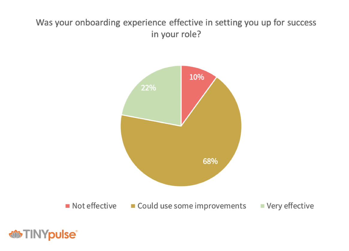
Pie charts are best used to show how different categories comprise a whole. For example, a pie chart could be used to show how participants rated the effectiveness of an onboarding program.
Tip: If you’re using a pie chart, try to keep below five categories so that the visuals are clear. If needed, group the categories with lower responses as “other.”
Bar graph
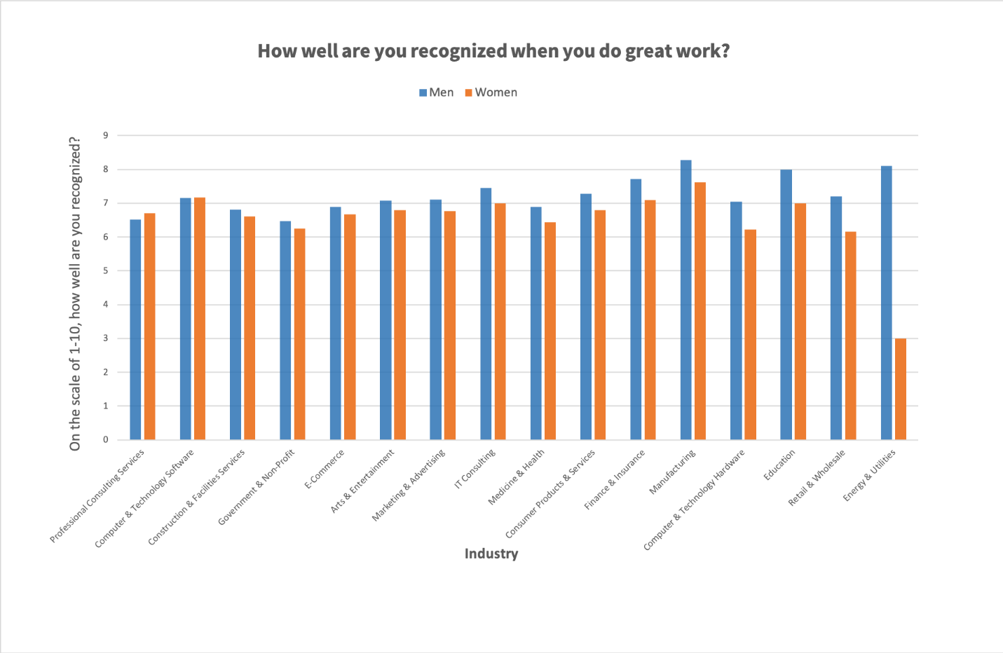
If you want to compare responses from different groups or show how a simple trend has changed over time, a bar graph is a good way to display this data. For example, you could use a bar graph to show how different employee segments responded to a question.
Line chart
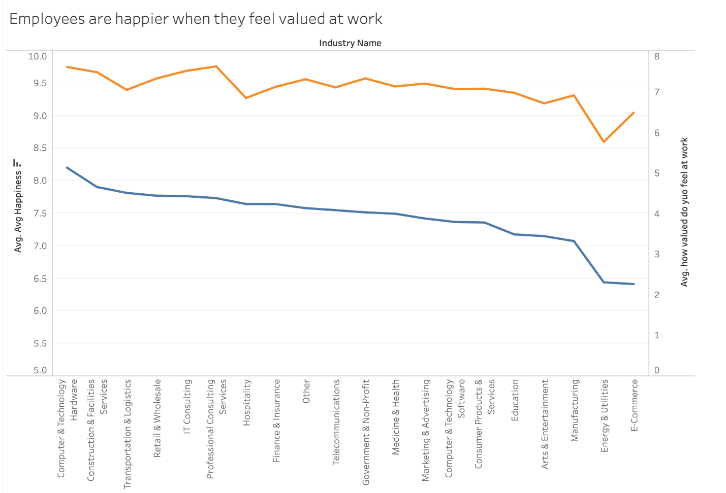
Line graphs are a good way to compare two sets of data. It also makes it easier to display small, but valuable changes that wouldn’t necessary be as visible on a bar graph.
Call out graphics
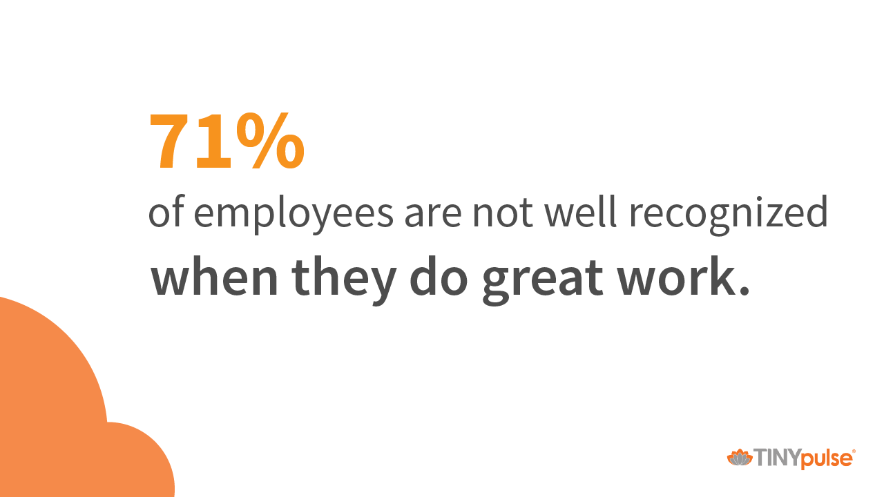
If you have a particular survey result worth you want your employees to notice, a call out graphic may help. By presenting the data separate from other facts, you can capture their attention. This works particularly well if the information is surprising and is something that they are emotionally invested in.
Action is the Most Important Step

Once you’ve “digested” the data, it’s time to report back. This is the most important part of analyzing your survey results: taking action.
By reporting your survey responses back on an ongoing basis, your staff will get used to the process and appreciate your transparency.
Communicate the findings even if you’re not pleased with the results. Look at it as an opportunity to promote transparency and willingness to make employees part of the solution.
What communication vehicles work best in your work environment? Does the same platform work for everyone? If not, get the word out across multiple communication channels.
Consider circling back on changes and enhancements inspired by survey response. Be sure to point out if scores are improving over time. This reinforces the company’s commitment to employee feedback.
Encourage employees to offer anonymous feedback and voice concerns whenever they have them—not just on formal surveys. Acting on those results will allow you to make continuous improvements and create a better, more engaged workforce.
And that’s the ticket to happier staff, happier customers, and a stronger bottom line.
.png?width=534&height=632&name=blog%20ad%20(1).png)
Share this

10 Questions You Need to Ask in Your First Employee Survey

Why Anonymous Employee Surveys Fail & What to Do Instead